[In the last post, I talked about showing various learning algorithms from the perspective of predictions within the “feature space”. Feature space being a perspective of the model that looks at the predictions relative to the variables used in the model, as opposed geographic distribution or individual performance metrics.
I am adding to that post the Gaussian Process (GP) model and a fun animation Or two.

So what’s a GP?
The explanation will differ depending on the domain of the person you ask but essentially a GP is a mathematical construction that uses a multivariate Gaussian distribution to represent an infinite number of functions the describe your data, priors, and covariance. Each data point gets Gaussian distribution and these are all jointly represented as the multivariate Gaussian. The choice of the Gaussian is key to this as it makes the problem tractable based on some very convenient properties of the multivariate Gaussian. When referring to a GP one may be talking about regression, classification, a fully Bayesian method, some form or arbitrary functions, or some other cool stuff I am too dense to understand. That is a broad and overly-simplistic explanation, but I am overly-simplistic and trying to figure it out myself. There is a lot of great material on the web and videos on youtube to learn about GP.
So why use it for archaeology?
GP’s allow for the the estimation of stationary nonlinear continuous functions across an arbitrary dimensional space; so it has that going for it… which is nice. But more to the point, it allows for the selection of a specific likelihood, priors, and a covariance structure (kernel) to create a highly tunable probabilisitic classifier. The examples below use the kernlab::gausspr() function to compute the GP using Laplace approximation with a Gaussian noise kernel. The 

On to the plots…
As in the previous post, the plot here has the intention to show how the prediction of site probability (yellow to purple raster backdrop) responds within a bivariate feature space. Further, how the training data (red dots) and test data (green dots) lay in relation to the predictions. Also as previously discussed, this method is more in tune with an exploratory analysis and not necessarily a presentation to convey an understanding; as this plot require a bit more un-communicated context [more on that in a later post]. What is to be taken from this is to see how the algorithm extrapolates prediction probability throughout the space of possible samples and then beyond into unknown regions. Then repeat this process over a range of hyperparameters to see how the sensitive the model is to changes. This allows the analyst to see a model fit and the balance between underfit vs. overfit without having to rely solely on a single metric; which may not embody the nuance of the actual fit. That, or maybe I just like pictures…
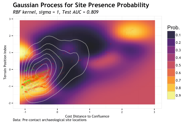
The above plot shows the predictions of a GP with a
For nonexclusive and non-exhaustive possibility #1, we could run a number of analysis to better understand the nature of these outlying samples. Ideally, we would have a notion of this before getting to this stage. Depending on the outcome of that analysis we would be confronted with decisions regarding these being of a different population [in the data sense, not cultural, but maybe cultural…] or what we level of false-negatives we are willing to accept to focus our predictions on the areas that are not outliers. Possibility #2 follows right after the tradeoff of false-negatives and false-positives. If we broaden our hypothesis, then we need to accept that more of the landscape is sensitive and conversely that additional variables/models should be considered. This is not a bad thing at all, but where you go from there is entirely dependent on why you are making the model in the first place (management, research, etc…). Finally, possibility #3 is a more technical issue, but inherently related to the previous two issues. The models ability to generalize is relative to what you are using it for (in part, your assumptions), how representative your data is, and how your model incorporates these two things. In a general sense, the tuning of the model hyperparameter
![]()
Hyperparameter search
Dealing with issues #1 and #2 are up to you and beyond the scope here, but we can take a look at #3. Using the same plot as above, we can see what happens as we alter the 
What is the best sigma?
I don’t know, lets sweep some plausible parameters and see what the plots look like vis a vis the performance metric (AUC).
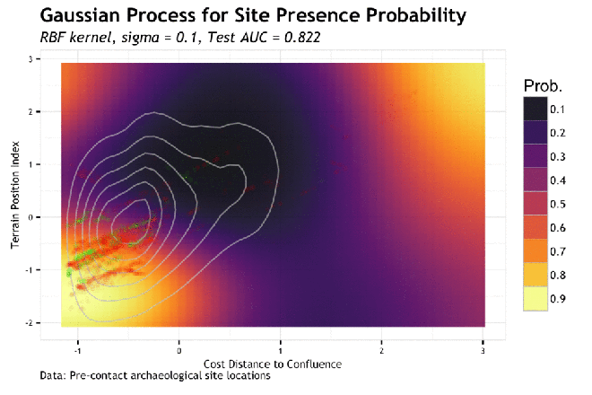
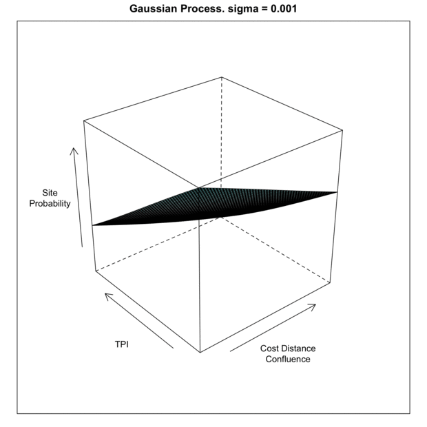
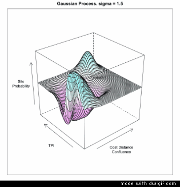
As the sigma in increased, the model piles more predictive mass onto the training point locations. This makes sense given that the sigma is the inverse kernel width and larger sigma equals a more narrow kernel; therefore spiked probabilities. Based on this, it is clear that the model appears to generalize better with smaller values of sigma. If we compare the gif to the the charted metrics below, we how the AUC corresponds to the increasing sigma for both training and test sets. This is a pretty standard view of the trade-off between model complexity (increasing sigma) and model generalization (increased test set AUC). The bottom line is that while training data continues to show improvement as sigma increases, the independent test set has the highest AUC at the lowest AUC; this is the most general model. The findings of the line graph below mirror the spatial arrangement of predictive mass in the gif above. Low sigma creates wide and sweeping predictions of large areas of feature space leading to predicting much of the data well, but misses some completely; generalizes well. Alternatively, the high sigma model zeros in on the training data, to the detriment of missing areas that very well may have observations in the test sets; generalizes poorly.

Okay, so lowest sigma, or thereabouts, gives us the best generalization, fits the anticipated response, and achieves a relatively high AUC by correctly classifying many of the test observations at a high probability. Do this over a k-folds CV and we check the error metric variance. Speaking of, as mentioned in this post, I have come up with better metrics for ultimately describing site prediction accuracy. However, in much of my testing, AUC has been the best metric to screen the hyperparameter space.
IN 3D!!!!!!!!!
Ok, but what does it look like looped in 3D!?!? Tufte may be rolling in his grave (he is not dead), but I really like this as far an in intuition building animation. This is over and under fitting visualized. Perhaps a bit 1990’s, or something, but darn if it does not drive home the point of data fit and generalization across the hyperparameter range. I could use “small multiples” or distill the over/underfit into a single metric to graph, but it misses on the interactivity of seeing a response across a continuous space.
Or as the say…

[…] Gaussian Process in Feature Space […]
LikeLike
LIKE
LikeLike