Conway’s Game of Life + Zombies in ggaminate

gameoflife_Fotor

I was reading a new paper entitle Rethinking the Role of Agent Based Modeling in Archaeology by Cegielski (@Whcegielskiand Rogers [paywall to paper] and I was struck reminiscing about my infatuation with the topic.  I used to do a lot of research on ABM and particularly the philosophy of Emergence, but I have drifted away from it in recent years in favor or more quantitative/statistical/inferential methods (I am not sure if that is a suitable differentiation…)  This is not to say that I didn’t enjoy every paper/presentation I have seen by the likes of@CDWren,  @er_crema@Iza_Romanowska, and Kholer & Co. Whichever the case, Cegielski and Rogers was a great way to get back into some of the happenings in ABM and I really agree with a lot of what they say.  More on that in a future post.

Reading this paper reminded me of my love for Cellular Automata (CA) . I remember waiting with bated breath as Stephan Wolfram’s A New Kind Of Science hit the shelves in 2002 (you often had to physically go to book store back then).  I poured over those 1200 pages and tried to figure out that the hell it meant for understanding past human experience (a work in progress).  Cellular Automata, L Systems, and Complexity were all that mattered; oh the good old days… Thinking of this, my mind blended by old interest with my new obsession with all things gganimate, and this post was born! I want to implement CA in ggplot and make a gif with gganimate. Enter…

Conways’s Game of Life


Conway’s Game of Life  (GOL) is the canonical example of cellular automata and the ideas of the complex being born for simple rules and high variability outcomes based on low variability initial conditions. As stated in Wikipedia, the rules of the game are:

  1. Any live cell with fewer than two live neighbours dies, as if caused by under-population.
  2. Any live cell with two or three live neighbours lives on to the next generation.
  3. Any live cell with more than three live neighbours dies, as if by over-population.
  4. Any dead cell with exactly three live neighbours becomes a live cell, as if by reproduction.

The GOL is a pretty standard test for coders and comp. sci. folks who what a little challenge. It has been implemented in R many time and therefore, I will steal it to make my life easier.  What follows is based on John Ramey’s (@ramhiser) post Conway’s Game of Life in R with ggplot2 and animation.  In this post John goes over some GOL basics and then offers his code to do what the title suggests.  Thanks to John’s great work, the guts of the code had two functions for computing the GOL grids using the foreach parallel back-end; cool stuff.  Then John uses ggplot2 and the animation package, but I reworked most of that to make it work with gganimate.

GOL1b

Better Yet!!! I watch too much TV including the Walking Dead, so I want to make a Game of Zombies!  GOL but, with an afterlife…

GOL1a

With the options for various afterlife spans and colorBrewer colors!

GOL1c.gif

Sizes, densities, intervals…

GOL1d.gif


R Code is here

Conway’s Game of Life + Zombies in ggaminate

Model Overfitting – Some basics

“With four parameters I can fit an elephant and with five I can make him wiggle his trunk.” – John von Neumann

This post came about for two reasons:

  1. I’ve been playing with @drob‘s gganimate package for ggplot2 and it is really fun; and hopefully useful in demonstrating my point.
  2. Overfitting is arguably the single most important concept to understand in prediction. It should wake you out of a deep sleep at 3am asking yourself, ” Is my model overfit?”

The first point is fun and games, the second is very serious. Fortunately, using gganimate is simple, but unfortunately dealing with overfitting can be very difficult.

line1a

Overfitting is a pretty easy concept; your model fits your data very well, but performed poorly when predicting new data. This happens because your model fit the noise of you data; likely because it is too flexible or complex. If a model employees many degrees of freedom, it is very flexible and can seek out every data point leading to a wiggly line that misses the underlying signal that you are attempting to model. Note that the concept here is part and parcel with the concept of Bias & Variance trade-off, but I’ll sidestep that and save it for another time.

An overfit model will appear to be very accurate when compared to the data used to build (aka “train”) the model. This is because with every additional degree of freedom your error (e.g. Root Mean Square Error [RMSE]) will decrease. The more flexibility, the lower the error; yeah pack it up, we can go home now. Complex models.. FTW!

Hold on tiger… the problem is as flexibility increases the model fits more and more to the noise that is unique to the particular data sample you are training the model on. This particular noise will not likely be present in another sample drawn from the same overall population. Therefore, a model that has low error because it strongly fits the noise of the training data, will have a high rate of error on new data that has different noise. However. not all is lost: the trick is to balance model complexity to achieve optimal error rates considering both data sets and your modeling objective. Let’s see some plots.

trainv test

The plot above demonstrates this concept by showing an increasing complex model (red line) fit to the training data sample in the top pane. The bottom pane shows a larger sample of testing data that is more representative of the total target population. The red line in the lower pain is the prediction of the testing data based on the model fit to the training data above.

The key thing to note is the increased flexibility as the model complexity increases (i.e. polynomial degrees) and how it more tightly fits the variation in the training data. At the same time, that model predictions for testing data are much more complex than necessary because the model is anticipating a data set just like the one it trained on. The RMSE of the training set continues to drop as the model becomes more complex, but the testing RMSE only drops to a point and then rises as the model becomes more overfit.  An overfit model is a one trick pony. Don’t be a one trick pony.

I prefer a little bit of analogy, so for an archaeological example we can pretend that this data represents something like the y = count of rhyolite flakes and x = count of chert flakes on site within a drainage basin.  We observe in our small sample that there tends to be high amounts of rhyolite where there is little chert, but also that even for high amounts of chert there is a pretty consistently moderate amount of rhyolite.  Framing it that way, we can see how our small sample holds the general trend of all the unobserved sites in the basin, but if we fit too flexible of a model, we will estimate quantities that are simply the result of our limited sample size.

This is only for one train/test set, so maybe it is just a bad random draw, right?  Not really. Simulating this over 100 permutations of this data population show the textbook test/train error curves when aggregated to their mean. The red line for training error will continue to decrease as model complexity increases. It will level out, but it will not increase. On the other hand, the test data error decreases until the population parameters are approximated and then it increases as the model becomes over fit. This clearly depicts the risk in being over confident in a model that has a low training error.

Error over Complexity

In the graphic above, the degree of model complexity at which both errors are, on average, closest is around a linear fit (1st order) or second degree polynomial, but the point at which the model test error is lowest is around a 5 or 6 degree polynomial.  This data was low order polynomial model, so the lower error of the 6 degree model is likely more adaptation to noise.

Among competing hypotheses, the one with the fewest assumptions should be selected Occam’s Razor

While we addressed the issues of indefinitely sliding off into high complexity hell by using a test data set to get to the neighborhood of test/train error balance, this is only part of the problem. At this point, we hit the crux of the model complexity problem; how much model simplicity and interpretive capability to we want to give up for improved prediction? The linear fit of the first order polynomial is simply the wrong model, but has a very easy interpretation regarding the relationship of y|x; maybe its good enough?  On the other hand a 6th degree polynomial is a pretty insanely complex model for most responses and will give you very little in the way of inference.  Pick say a 3rd degree polynomial and you give up some predictive accuracy, you do gain the ability to have some insight into that the coefficients mean; even better for a second degree model. The model you chose depends entirely on why you are modeling the data in the first place.

From here, this discussion can drift off into any number of related directions about prediction vs. inference, Bayesian vs. Frequentist, regularization, AIC/BIC/CP, cross-validation, bias vs. variance, lost functions, etc… but that will be for another time. In the mean time, make sure you model is behaving.

Notes:

    1. The model used to generate the data used above follows as:

y\sim\mathcal{N}(\mu, \sigma) \\ \mu = \alpha+\beta1*x^{-0.3} \\ \alpha\sim\mathcal{N}(50, 1) \\ \beta1\sim\mathcal{N}(30, 1) \\ \sigma\sim\mathcal{N}(2.5, 0.1)

  1. After writing this, I happened to run across another blog discussing overfitting that also used that von Neumann quote to open.  I never said I was original.
  2. This is a overly simplified view of model overfitting, but is intended for a reader at an introductory level of modeling.
  3. R code for this post is this Gist


Model Overfitting – Some basics

Simpson’s Paradox in Action

Simpson’s paradox, or the Yule–Simpson effect, is a paradox in probability and statistics, in which a trend appears in different groups of data but disappears or reverses when these groups are combined.” ~ Wikipedia

I just got Simpson’s Paradox’ed and it feels so good!  This is often a bad thing, as your analysis may come to a wrong conclusion if the data is viewed at the wrong level or you have latent grouping.  But just now it helped me understand a problem and I figured I would tell the internet about it (like it or not).

This is not the best example of the Simpson’s Paradox, but I think it is illustrative. I have a set of 150 points taken with a GPS, most taken with a very high accuracy RTK network and other with less accurate SBAS.  However, I do not know which shots were by which method. My end calculation are showing a bias towards my elevations being about a half foot too high when compared to highly accurate LiDAR derived DEM. I began to suspect a vertical datum shift, but metadata and RTK information said they matched; then again, metadata and documentation can lie.  I figured I could use the Vertical Dilution of Precision (VDOP) to detect the datum shift, so I set about plotting my data and estimating the linear trend.

RTK_grouped

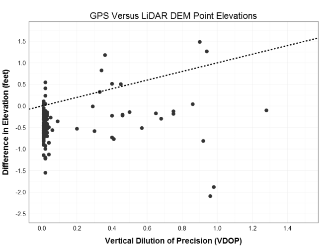
The slope of the linear fit is 0.44 suggesting a positive relationship between the VDOP and difference in elevation (increasing VDOP by 1 increases the delta elevation by 0.44 feet). However, this is counter intuitive given the increase in error (VDOP) is getting me closer to my target (delta elevation of zero).  Albeit counterproductive, this suggests that the higher VDOP points are closer to target, and therefore may be the points in the correct vertical datum.  based on a visual inspection of the data, I drew an arbitrary class boundary at VDOP = 0.25 to establish possible RTK vs. non-RTK groups.  Given these the same treatment illustrates the point of this post: Simpson’s Paradox!

RTK_seperated

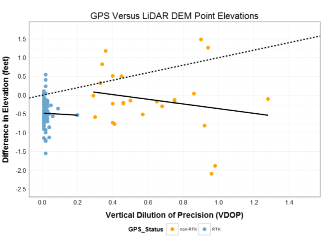
When the points are grouped and the linear trend is refit, the slope changes direction!  Instead of the positive 0.44 of the aggregated data,the individual groups have negative slopes of -0.62 for non-RTK and -1.3 for RTK (the direction of the slope is important part here).  Firstly, the negative slope for each group gives the more initiative result that higher VDOP error moves us further from the target elevation. Secondly, the possible RTK group is close to the 0.5 ft bias I had detected, while the non-RTK is closer to zero (which much more variability (see below) because of the lack of real-time post processing).  The fact that the signs switched (the paradox part) and that my group means are close to the biased and true targets (see below) gives me confidence that I can identify the points with the incorrect vertical data and correct for it!  Thank you Simpson’s Paradox.

RTK_seperated_mean

PS – These are high accuracy GPS measurement, but they are used only for planning purposes; not construction of regulatory use.  If that point at VDOP 0.2 should actually be in the non-RTK cluster and it gets correct as if it were RTK, no one will get hurt and no buildings will fall over.

*** below is the R code for the ggplot2 examples, but because it is a client project I cannot share the data.

Data prep and first plot

## Prepare data for plotting
pdat <- data.frame(elev_diff2 = sdat1$elev_diff, vdop = sdat1$vdop,                    hdop = sdat1$hdop, pdop = sdat1$pdop,                    Status = ifelse(sdat1$vdop > 0.25, "non-RTK", "RTK"))
colnames(pdat) <- c("Elevation_Difference", "VDOP", "HDOP", "PDOP", "GPS_Status")

## first plot
ggplot(data = pdat, aes(x = VDOP, y = Elevation_Difference)) +
geom_point(size = 5, shape = 20, color = "gray20") +
geom_abline(size = 1, linetype = "dashed") +
# geom_smooth(method="lm", se=FALSE) +
# stat_smooth(method="lm", formula=y~1, se=FALSE) +
# scale_color_manual(values = c("orange", "skyblue3")) +
scale_x_continuous(breaks = seq(0, 1.5, 0.2), limits = c(0, 1.5)) +
scale_y_continuous(breaks = seq(-2.5, 1.75, 0.5), limits = c(-2.5, 1.75)) +
ylab("Difference in Elevation (feet)") +
xlab("Vertical Dilution of Precision (VDOP)") +
ggtitle("GPS Versus LiDAR DEM Point Elevations") +
theme_bw() +
theme(
axis.title.y = element_text(hjust = 0.5, vjust = 1.5, angle = 90, size=rel(1), face="bold"),
axis.title.x = element_text(vjust = -0.5, size=rel(1), face="bold"),
title = element_text(size=rel(1.5)),
axis.ticks.x = element_blank(),
axis.ticks.y = element_blank(),
axis.text.x = element_text(size=rel(1.5)),
axis.text.y = element_text(size=rel(1.5)))

Second Plot

ggplot(data = pdat, aes(x = VDOP, y = Elevation_Difference ,
group = GPS_Status, color = GPS_Status)) +
geom_point(size = 5, shape = 20) +
geom_abline(size = 1, linetype = "dashed") +
geom_smooth(method="lm", se=FALSE, color = "black", size = 1) +
# stat_smooth(method="lm", formula=y~1, se=FALSE) +
scale_color_manual(values = c("orange", "skyblue3")) +
scale_x_continuous(breaks = seq(0, 1.5, 0.2), limits = c(0, 1.5)) +
scale_y_continuous(breaks = seq(-2.5, 1.75, 0.5), limits = c(-2.5, 1.75)) +
ylab("Difference in Elevation (feet)") +
xlab("Vertical Dilution of Precision (VDOP)") +
ggtitle("GPS Versus LiDAR DEM Point Elevations") +
theme_bw() +
theme(
axis.title.y = element_text(hjust = 0.5, vjust = 1.5, angle = 90, size=rel(1), face="bold"),
axis.title.x = element_text(vjust = -0.5, size=rel(1), face="bold"),
title = element_text(size=rel(1.5)),
axis.ticks.x = element_blank(),
axis.ticks.y = element_blank(),
legend.position = "bottom",
axis.text.x = element_text(size=rel(1.5)),
axis.text.y = element_text(size=rel(1.5)))

Third plot

ggplot(data = pdat, aes(x = VDOP, y = Elevation_Difference ,
group = GPS_Status, color = GPS_Status)) +
geom_point(size = 5, shape = 20) +
geom_abline(size = 1, linetype = "dashed") +
geom_smooth(method="lm", se=FALSE, color = "black", size = 1) +
stat_smooth(method="lm", formula=y~1, se=TRUE, size = 1) +
scale_color_manual(values = c("orange", "skyblue3")) +
scale_x_continuous(breaks = seq(0, 1.5, 0.2), limits = c(0, 1.5)) +
scale_y_continuous(breaks = seq(-2.5, 1.75, 0.5), limits = c(-2.5, 1.75)) +
ylab("Difference in Elevation (feet)") +
xlab("Vertical Dilution of Precision (VDOP)") +
ggtitle("GPS Versus LiDAR DEM Point Elevations") +
theme_bw() +
theme(
axis.title.y = element_text(hjust = 0.5, vjust = 1.5, angle = 90, size=rel(1), face="bold"),
axis.title.x = element_text(vjust = -0.5, size=rel(1), face="bold"),
title = element_text(size=rel(1.5)),
axis.ticks.x = element_blank(),
axis.ticks.y = element_blank(),
legend.position = "bottom",
axis.text.x = element_text(size=rel(1.5)),
axis.text.y = element_text(size=rel(1.5)))

Linear fits

m1 <- lm(elev_diff ~ vdop, data = sdat1)
summary(m1) 

m2 <- lm(elev_diff ~ vdop, data = sdat1[which(sdat1$vdop > 0.25),])
summary(m2) 

m3 <- lm(elev_diff ~ vdop, data = sdat1[which(sdat1$vdop < 0.25),])
summary(m3)


Simpson’s Paradox in Action