Important note: This only works with the Development version of ggplot2! (as of 3/18/2016). Find this at Github
I was planning on making a whole post about my fascination for Ezra B. Zubrow’s work, but in the interim I put together some fun plots of the data I plan to write about. I am putting this post together to get that code out there and show a few cool new things that ggplot2 v2.0+ allow for. Everything that follows is 110% thanks to the hard work of @hadleywickham for creating the incredible ggplot2, @hrbrmstr for adding subtitles/captions, @ClausWilke for the wonderful cowplot package.
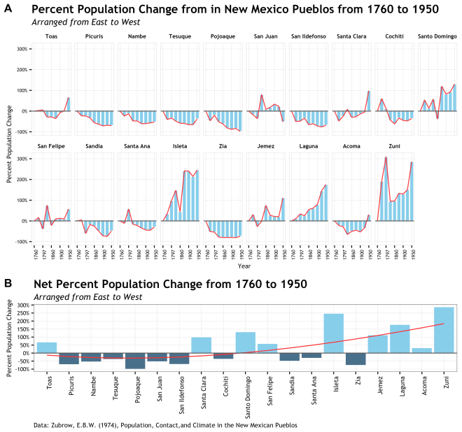
The plot/graph/data viz/pretty picture that I tweeted out last night was my first draft of presenting population migration data from Zubrow’s 1974 Population Contact Climate New Mexican Pueblos. Below I will present the R code and go through a few of the steps that pulled it together. [link to code in Gist]
The process to make this was actually very easy thanks to the strides of those mentioned above. It is all really just a straightforward use of their code.
- Data Preparation (Zubrow 1974, R and dplyr)
- Decide how to organize and present to show intentions (brain)
- Plot each panel individually (ggplot2)
- Stick plots together (cowplot)
- Get some more ice cream (spoon & bowl)
The data prep started with manually lifting the data from the publication (Zubrow 1974: pg 68-69, Table 8) and structuring it in such a way to minimize repetition and get it ready for plotting. I am not a very efficient coder, so other will likely find ways to do this better. This follows the “wide data” format, which is basically adding columns of variables to a rows which each contain a single observation (population). See here and here and here for discussion of various “tidy” data formats.
library("ggplot2") # Must use Dev version as of 03/18/16
library("gridExtra")
library("extrafont") # for font selection
library("dplyr") # for data preperation
library("cowplot") # for combining plots

# Prepare data for plotting
# data from Zubrow, E.B.W. (1974), Population, Contact,and Climate in the New Mexican Pueblos
# prepared as a long format to facilitate plotting
year <- c(1760, 1790, 1797, 1850, 1860, 1889, 1900, 1910, 1950)
sites <- c("Isleta", "Acoma", "Laguna", "Zuni", "Sandia", "San Felipe",
"Santa Ana", "Zia", "Santo Domingo", "Jemez", "Cochiti",
"Tesuque", "Nambe", "San Ildefonso", "Pojoaque", "Santa Clara",
"San Juan", "Picuris", "Toas")
# [sites] are arranged in South to North geographic order
south <- c(seq_along(sites))
# add index to rearrange geographically from East to West
east <- c(14, 18, 17, 19, 12, 11, 13, 15, 10, 16, 9, 4, 3, 7, 5, 8, 6, 2, 1)
# population figures
pop <- c(
c(304, 410, 603, 751, 440, 1037, 1035, 956, 1051),
c(1052, 820, 757, 367, 523, 582, 492, 691, 1376),
c(600, 668, 802, 749, 929, 970, 1077, 1472, 1655),
c(664, 1935, 2716, 1294, 1300, 1547, 1525, 1667, 2564),
c(291, 304, 116, 241, 217, 150, 81, 73, 150),
c(458, 532, 282, 800, 360, 501, 515, 502, 721),
c(404, 356, 634, 339, 316, 264, 228, 219, 285),
c(568, 275, 262, 124, 115, 113, 115, 109, 145),
c(424, 650, 483, 666, 262, 930, 771, 817, 978),
c(373, 485, 272, 365, 650, 474, 452, 449, 789),
c(450, 720, 505, 254, 172, 300, 247, 237, 289),
c(232, 138, 155, 119, 97, 94, 80, 80, 145),
c(204, 155, 178, 107, 107, 80, 81, 88, 96),
c(484, 240, 251, 319, 166, 189, 137, 114, 152),
c(99, 53, 79, 48, 37, 18, 12, 16, 2),
c(257, 134, 193, 279, 179, 187, 222, 243, 511),
c(316, 260, 202, 568, 343, 373, 422, 388, 152),
c(328, 254, 251, 222, 143, 120, 95, 104, 99),
c(505, 518, 531, 361, 363, 324, 462, 517, 842)
)
# combine above in a data.frame where each population is the key observation
dat <- data.frame(Year = rep(year, length(sites)),
Site = rep(sites, each = length(year)),
Population = pop,
South = rep(south, each = length(year)),
East = rep(east, each = length(year)))
# add a factor that arranges the levels of site by their East to West geographic location
dat$East_label <- rep(factor(sites, levels = (sites[order(east)])), each = length(year))

# Calculate quantities of interest
# this ibe-liner calculates the date to date change in population
# ave() groups and runs the diff() function that is concatenated with a 0 for the first observation in each group
# probably can make this dplyr, but it works...
dat$Change <- ave(dat$Population, dat$Site, FUN = function(x) c(0, diff(x)))
# using dplyr to group the observations by site/Pueblo and calcualte stuff
dat <- group_by(dat, Site) %>%
# change from inception date of 1760 (first data point)
mutate(Relative_Change = Population - Population[1]) %>%
# percent change of log population (not used in this graphic)
mutate(Percent_Change = (Population - lag(Population))/lag(Population)) %>%
# change from inception scaled to % change from inception
mutate(Scaled_Change = (Relative_Change / Population[1])) %>%
# make into a data.frame
data.frame()

# select only the rows that are the last time period observation of 1950
# this is for the second plot
net_change <- dat[which(dat$Year == 1950),]
Plot Intentions (a.k.a skip down if you just want code)
Now that the data is entered, formatted, and the quantities of interest are calculated, its time to start plotting. I imagine everyone does it this way, but my simple method for building a ggplot is simply to start simple and then add in calls for ever finer detail. Here is an amazing tutorial on building a ggplot that really covers all the bases. I could add little to that link as far as approach and basics, however I will add that going from the basics to the plot you see in your head can be quite difficult! Most of the “issues” I run into making a plot that is remotely complicated are almost always because I didn’t think through what I really want to see and what the technical implications of that will be. All you smart people probably won’t have that problem, but for me there has been a proportional shift to increased time spent thinking about a plot versus a decrease in time spent coding a plot as I get more experience.
The intention of this plot is to support an argument made by Zubrow that there was a 18th to 20th century population shift in Pueblo society based on cultural contact and climate change. Of course it will take more that a single graphic to make this point, but a single graphic would go a long way to help a reader see it. To that end, I first decided on a graphic that would be focused on the percent change from the date of the first data point at 1760. I wanted to use percent change to scale the y axis a bit more evenly since some of Pueblos had total populations that dwarfed the smaller pueblos and decreased the visual impact of the trend. Further, period over period change was pretty variable and did not tell the story. Secondly, since there is a geographic component to this population shift, I need to arrange the Pueblo data groups geographically East to West. Ideally this would be done a s single row, but there are too many sites for that to work.
Additionally, there is the issue about site specific population change and overall population change and how that interacts over time. This is why using two plots made sense here. The top plot to show that site specific percent change over time and the lower plot to show the net change across geography form the inception date of 1760. But enough about that, lets see some code!
Plot #1: Site specific percent population change over time
# plotting with ggplot2 (dev version from github)
# I started doing the [p1 <- p1 +] way to build these b/c others did and
# I liked how I could add selective lines while testing without changing anything
# so, it is more things to type, but whatever. It can be done in one ggplot() call if you like
# also, I code to get stuff done then optimize later. You may likey find ways to do this better

# Plot #1: Percent change from inception for each site
# set up data and axis
p1 <- ggplot(dat, aes(x = as.factor(Year), y = Scaled_Change, group = East))
# this is the bar plot part
p1 <- p1 + geom_bar(stat="identity", fill = "skyblue", color = "white")
# this is the redline outlining the bars
p1 <- p1 + geom_line(color = "firebrick1", alpha = 0.95)
# wrap it by the reordered factor so each individual site plots
p1 <- p1 + facet_wrap( ~ East_label, nrow = 2)
# add a reference line at zero
p1 <- p1 + geom_hline(yintercept = 0, linetype = 1, color = "gray35", size = 0.5)
# scale the y axis and calculate it as a percentage
p1 <- p1 + scale_y_continuous(breaks = c(seq(-1,3,1)), labels = scales::percent)
# thin out the dates in the x axis
p1 <- p1 + scale_x_discrete(breaks = c(1760, 1797, 1860, 1900, 1950))
# trusty old theme_bw() to prepare the look of the plot
p1 <- p1 + theme_bw()
# fine suggestion by @ClausWilke to make plot less busy
p1 <- p1 + background_grid(major = "xy", minor = "none")
# add the title, subtitle, and axis labels
# this is a new feature only available in the dev version of ggplot2
p1 <- p1 + labs(title="Percent Population Change from in New Mexico Pueblos from 1760 to 1950",
subtitle="Arranged from East to West",
x = "Year",
y = "Percent Population Change")
# all the things in the theme() section that stylize the plot and fonts
p1 <- p1 + theme(
strip.background = element_rect(colour = "white", fill = "white"),
strip.text.x = element_text(colour = "black", size = 7, face = "bold",
family = "Trebuchet MS"),
panel.margin = unit(0.3, "lines"),
panel.border = element_rect(colour = "gray90"),
axis.text.x = element_text(angle = 90, size = 6, family = "Trebuchet MS"),
axis.text.y = element_text(size = 6, family = "Trebuchet MS"),
axis.title = element_text(size = 8, family = "Trebuchet MS"),
# the three elements below are all new to the dev ersion
plot.caption = element_text(size = 8, hjust=0, margin=margin(t=5),
family = "Trebuchet MS"),
plot.title=element_text(family="TrebuchetMS-Bold"),
plot.subtitle=element_text(family="TrebuchetMS-Italic")
)

Aside from a pretty straightforward ggplot, some interesting notes are the use of labs() to set up the title, X, Y, sub-title, and caption text. This new feature that is currently in the development version is thanks to @hrbmstr and detailed in his recent post. Basically, just add your text at the right tag and style accordingly; instant badass plotting! The other thing is the use of custom fonts. This takes a small bit of setup and can be a pain on a Windows machine, but is explained well by @zevross on his site here. Everything else is a pretty basic design decision based on the data and intention. I used the line to make the trend jump out and used the bars to emphasize the space. I almost always start with theme_bw() as a base. Oh, and I love skyblue; I can’t make a plot without it.
The second plot took the net percent change for just the 1950 data point for each pueblo. This was an easy way to show net change over that time period and assign a single number to each site. Plus I would not have to facet and it would fit very nicely below the previous plot.
Plot #2: Net percent population change per Pueblo
# Plot #2: Net change in population by site
# this uses a different data.frame from plot #1
# most of this is all the same as Plot #1, but not faceted.
# one trick here is to have two geom_bar calls, but the second is just data below the 0 line
p2 <- ggplot(data = net_change, aes(x = East_label, y = Scaled_Change, group = Year))
# first call to geom_bar for all data
p2 <- p2 + geom_bar(stat="identity", fill = "skyblue")
# second call to geom_bar for just negative data with a different color
p2 <- p2 + geom_bar(data = net_change[which(net_change$Scaled_Change < 0),],
stat="identity", fill = "skyblue4")
# a spline smooth to add the fit that shows the trend of population flow
p2 <- p2 + geom_smooth(data = transform(net_change),
method = "lm", formula = y ~ splines::bs(x, 3),
se = FALSE, color = "firebrick1", size = 0.5)
p2 <- p2 + geom_hline(yintercept = 0, linetype = 1, color = "gray35", size = 0.5)
p2 <- p2 + scale_y_continuous(breaks = c(seq(-1,3,0.5)), labels = scales::percent)
p2 <- p2 + theme_bw()
# fine suggestion by @ClausWilke to make plot less busy
p2 <- p2 + background_grid(major = "xy", minor = "none")
# same new features as described in plot #1
p2 <- p2 + labs(title="Net Percent Population Change from 1760 to 1950",
subtitle="Arranged from East to West",
x = NULL,
y = "Percent Population Change",
caption="Data: Zubrow, E.B.W. (1974), Population, Contact,and Climate in the New Mexican Pueblos")
p2 <- p2 + theme(
axis.text.x = element_text(angle = 90, size = 8, hjust = 1, family = "Trebuchet MS"),
axis.text.y = element_text(size = 7, family = "Trebuchet MS"),
axis.title = element_text(size = 8, family = "Trebuchet MS"),
# same new features as described in plot #1
plot.caption = element_text(size = 8, hjust=0, margin=margin(t=5),
family = "Trebuchet MS"),
plot.title=element_text(family="TrebuchetMS-Bold"),
plot.subtitle=element_text(family="TrebuchetMS-Italic")
)

This plot simply used that same bits as above for subtitle and the added caption. The caption is only used once since this is the bottom graphic and they come from the same data. Fonts are the same. Now to the cool stuff.
Final plot: Putting it together with cowplot
This is where the magic happens thanks to the cowplot package. Cowplot is a ggplot2 add-on that allows for the creation of well formatted and publication ready graphics straight out of R. It achieves this though offering some basic themes with standard and appealing colors, line weights, font sizes, etc… and the ability to arrange multiple plots in one graphic. I only used the plot_grid() function to arrange the plots we made above, but the themes provided by cowplot are quite nice and you can also add annotation directly on top of your plots (e.g. DRAFT). This is really a great tool and I look forward to making it part of my practice.
</pre>
<pre># now the magic of cowplot to combine the plots
# plot_grid does the arranging of p1 and p2
# [labels] gives identification to each plot for your figure caption
# [nrow] arrnges them in stacked rows
# [rel_heights] is really important. This allows for the top plot to be made larger (1.75 times)
# than the lower plot. If your plots are not realtively equal in size, you may need this
# I adjusted by trial and error
cplot1 <- plot_grid(p1, p2, labels = c("A", "B"), nrow = 2, rel_heights = c(1.75,1))
# get an idea of what it looks like
plot(cplot1)
# save cowplot as an image!
# [base_width] and [base_height] allow of sizing the fina image Use in conjunction with [rel_heights]
save_plot("cowplot.png", cplot1, base_width = 8, base_height = 7.5)
# Done!
Final plot at top of post
The plot_grid() and save_plot() functions have some really key arguments that were invaluable here, specifically rel_width, rel_height for plot_grid() and base_width, base_height for save_plot(). Combining these, you can scale each graphic as a ration relative to the others and then adjust the overall size on save. This was important here because the bottom graphic was only intended to be a narrow strip below the faceted graphic that needs more headroom.
And that is about it. I wish I had come across some deep hack or new approach, but really I just took the tools that became available and put them together. I hope some of the code and discussion above help you see how to use these tools together and create interesting and vivid depictions of your data. If you have any questions or comments about this code, please find me @md_harris
Notes:
- The code in once place at this Gist
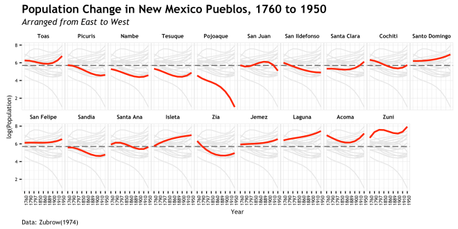
- There was a first pass at this data which resulted in the plot below. This was my first use of the new caption/subtitle feature. I know it was being worked on, but had to dig into github to find out that the pull request was accepted 4 hours before I set out to make the plot. Only after this plot did I decide to use a different approach to the data and then get into cowplot.
- Final note, if you are interested in these data and their interpretation, there is a lot more discussion to be had. This post is just about the visualization of it and it would take a textual context to justify the argument that is being conveyed here.

 Archaeology’s two most favorite things; Beer and Data. Put them together with the world’s most useful scientific data modeling and analysis language (of course I mean R) and it could have loads of fun! To that end, I am putting this out there to propose a time and place for an unofficial R + Beers get together at the the Society for American Archaeology annual meeting in Orlando, FL.


 , but the response is pretty much the same. The uncertainty of 1000 posterior draws of a single 3:1 background sample is presented here:
