Gaussian Process in Feature Space

[In the last post, I talked about showing various learning algorithms from the perspective of predictions within the “feature space”. Feature space being a perspective of the model that looks at the predictions relative to the variables used in the model, as opposed geographic distribution or individual performance metrics.

I am adding to that post the Gaussian Process (GP) model and a fun animation Or two.

sin4_header

So what’s a GP?

The explanation will differ depending on the domain of the person you ask but essentially a GP is a mathematical construction that uses a multivariate Gaussian distribution to represent an infinite number of functions the describe your data, priors, and covariance. Each data point gets Gaussian distribution and these are all jointly represented as the multivariate Gaussian. The choice of the Gaussian is key to this as it makes the problem tractable based on some very convenient properties of the multivariate Gaussian. When referring to a GP one may be talking about regression, classification, a fully Bayesian method, some form or arbitrary functions, or some other cool stuff I am too dense to understand. That is a broad and overly-simplistic explanation, but I am overly-simplistic and trying to figure it out myself.  There is a lot of great material on the web and videos on youtube to learn about GP.

So why use it for archaeology?

GP’s allow for the the estimation of stationary nonlinear continuous functions across an arbitrary dimensional space; so it has that going for it… which is nice. But more to the point, it allows for the selection of a specific likelihood, priors, and a covariance structure (kernel) to create a highly tunable probabilisitic classifier.  The examples below use the kernlab::gausspr() function to compute the GP using Laplace approximation with a Gaussian noise kernel.  The
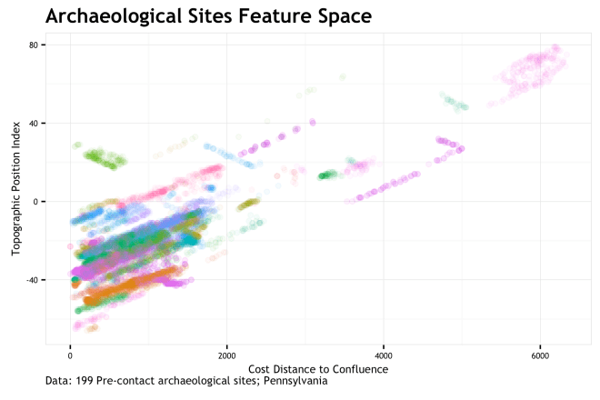
 \sigma hyperparameter of this Gaussian kernel is what is being optimized in the models below.  There are many kernels that can be used in modeling a GP.  One of the ideal aspects of a GP for archaeological data is that the continuous domain of the GP can over geographic space taking into consideration natural correlation in out samples. This has strong connections to Kriging as a form of spatial regression in the geostatistical realm, as well as relation to the SVM kernel methods of the previous post.

gopher-48499_640.png

On to the plots…

Continue reading “Gaussian Process in Feature Space”

Gaussian Process in Feature Space

To Feature Space and Beyond!

There are many of ways to look at predictive models.  Assumptions, data, predictions, features, etc… This post is about looking at predictions from the feature space perspective.  To me, at least for lower dimensional models, this is very instructive and illuminates aspects of the model (aka learning algorithm) that are not apparent in the fit or error metrics. Code for this post is in this gist.

IV_header2

Problem statement: I have a mental model, data, and a learning algorithm from which I derive predictions.  How well do the predictions fit my mental model? I can use error metrics from training and test sets to asses fit. I can use regularization and information criteria to be more confident in my fit, but these approaches only get me so far. [A Bayesian perspective offers a different perceptive on these issues, but I am not covering that here.] What I really want is a way to view how my model and predictions respond across the feature space to assess whether it fits my intuition. How do I visualize this?

Space: Geographic Vs. Feature

When I say feature space, I mean the way our data points align when measured by the variables/features/covariates that are used to define the target/response/dependent variable we are shooting for.  The easy counter to this is to think about geographic space.  Simply, geographic space is our observations measured by X and Y.  The {X,Y} pair is the horizontal and vertical coordinate pair (latitude, longitude) that put a site one the map.

site_location.png

So simply, geographic space is our site sample locations on a map.  The coordinates of the 199 sites (n=13,700 total measurements) are manipulated to protect site locations.  These points are colored by site.

Feature space?  Feature space is how the sites map out based not on {X,Y}, but based on the measure of some variables at the {X,Y} locations. In this case, I measure two variables at each coordinate, x_1 = cd_conf, anf x_2 = tpi_250c.  cd_conf is a cost distance to the nearest stream confluence with respect to slope and tpi_250c is the topographic position index over a 250 cell neighborhood.   If we map {x_1, x_2} 
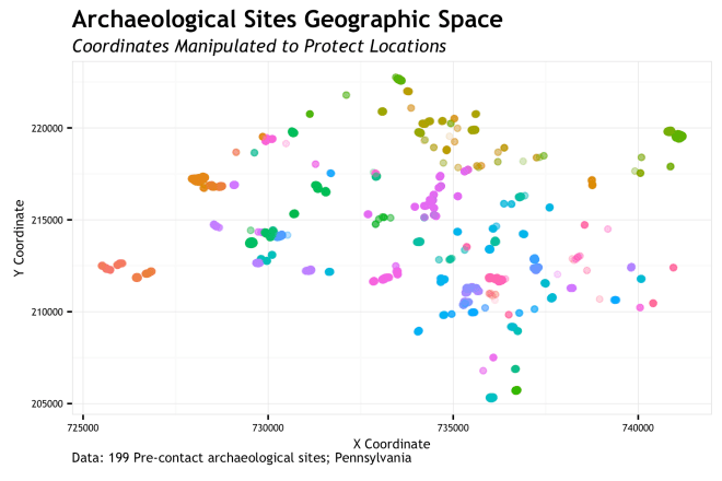
as our {X,Y} coordinates, we end up with…

site_feature_space

FEATURE SPACE!!!!!!!!! If you are familiar with this stuff, you may look at this graphic and say “Holy co-corellation Batman!”.  You would be correct in thinking this.  As each site is uniquely colored, it is apparent that measurements on most sites have a positively correlated stretch to them.  This is because the environment writ large has a correlation between these two variables; sites get caught up in the mix.  This bias is not fully addressed here, but is a big concern that should be addressed in real modeling scenarios.

Either way, feature space is just remapping the same {X,Y} points into the dimension of cd_conf and tpi_250c. Whereas geographic space shows a relatively dispersed site distribution, the feature space shows us that sites are quite clusters around low cd_conf and low tpi_250c.  Most sites are more proximal to a stream confluence and at lower topographic positions that the general environmental background.  Sure, that makes some sense.  So what… Continue reading “To Feature Space and Beyond!”

To Feature Space and Beyond!

SAA 2015 – Pennsylvania Predictive Model Set – Realigning Old Expectations with New Techniques in the Creation of a Statewide Archaeological Sensitivity Model

Quick post to archive my 2015 Society for American Archaeology (SAA) meeting presentation (San Francisco, CA).  Slide Share is at bottom of post or download here:  MattHarris_SAA2015_final

This presentation was all about the completion of the Pennsylvania Predictive model and some post-project expansion with a new testing scheme and the Extreme Gradient Boosting (XGB) classifier.

The presentation starts with a bit about the context for Archaeological Predictive Modeling (APM) and the basics of the machine learning approach. I call it Machine Learning (ML) here (because  I was in San Francisco after all), but I generally think of it as Statistical Learning (SL).  The slight shift in perspective is based on the focus of SL on the assumptions and statistical models, where as ML is more oriented to applied maths, comp sci., and DEEP LEARNING OF BIG DATA!  Just depending on how you want to look at it.

The presentation moves to understanding the characteristics of archaeological data that make it unique and challenging.  I think this is a critical area that gets so glossed over and offers so many excuses for us to not pursue model based approaches.  Okay, yes, our data kind of stink most of the time.  Let’s accept that, plan for it, and move along.accept_data

After my typical lecture on how the Bias/Variance trade-off should keep you up at night, I go into schematic descriptions of the learning algorithms: Logistic Regression, Multivariate Adaptive Regression Splines (MARS), Random Forest, and XGB. Then try to show how each algorithm, regardless of how “fancy”, can be conceptualized in a
“simple” way. The remainder of the presentation is a tour of prediction metrics for the four models applied to a portion of the state.

Unfortunately, this portion was only developed after the project had completed.  This is partially because of the timing of the contract, but also because some of these methods were not developed until later in the project, and by that time, I needed to follow the same general methods that the project started with for consistency.

The two big take aways from this part of the presentation are that 1) XGB “won” the model bake-off as it led to the lowest error on independent site sample across most sub-regions and sub-samples.  It was the most consistent and accurate (to the positive class) learner of the four; and 2) error can be viewed in two important ways, a) percent of observations within sites that are correctly classified and b) the percent of sites that are correctly classified.  Since each site is recorded as a measurement of each ~10×10-meter cell in a site, our error measurement can go either way.  If I say there is a 20% error rate, does that mean the 20% of each site is misclassified or that 20% of all sites are misclassified.  That is a subtle, but important distinction. The methods here calculate both aspect and then combine  both measures into a (poorly named) measure called Gain or Balance.  The penultimate slide gives a bunch of views of these metrics across the entire study area.

All in all, I am relatively  proud of this presentation in that it is the culmination of 2 years of intensive work that addressed many issues in APM that existed for 20 years.  It got over that hump and found a bunch of new issues that are a bit more contemporaneous with SL/ML/general modeling approaches.  Some interesting ways to view prediction error were developed, and they were visualized in a way that (at least to me) is pretty satisfying.  Let me know what you think!

pred

The Presentation:


SAA 2015 – Pennsylvania Predictive Model Set – Realigning Old Expectations with New Techniques in the Creation of a Statewide Archaeological Sensitivity Model