This is a study regarding the contextualization of the Kvamme Gain statistic, the evaluation of its characteristics, and justification for replacing it with the Youden’s J statistic for the evaluation of archaeological predictive models (APM) effectiveness based on single value metrics. This analysis is divided into two blog posts. Part 1 discusses the use of evaluation metrics, the characteristics of the Kvamme Gain (KG) statistic (the most common metric used to evaluate APMs), and then links the KG to the framework of the Confusion Matrix as a tool for evaluating classification problems. A Confusion Matrix is simply a 2 by 2 contingency table of correct and incorrect predictions. By placing the Kvamme Gain in the framework of the confusion matrix we can link the poorly studied task of APM quantitative evaluation to the very well-studied task of machine learning classification model evaluation. While archaeological data has unique characteristics that we will need to consider, the task of evaluating binary and multi-class classification is well documented and not unique to archaeology.
Part 2 of this post (not yet published) will then look at the characteristics of the KG and reveal some qualities that make is less appropriate for its use as a single value to evaluate APM. These qualities will be compared to the Youden’s J statistic and I will try to make a case for why it should be the primary APM statistic. The characteristics and relationship between these two metrics will be explored graphically to try to make some intuition regarding their usefulness.
Note: I strongly feel that a suite of appropriately chosen metrics is the most useful for evaluating model performance. However, boiling threshold-based classification performance down to a single number is a very common practice; so let’s do it the best we can.
“The key to keeping your balance is knowing when you’ve lost it” ~ Anonymous
So many metrics, so little time…
Archaeological Predictive Models, as well as all predictive models, typically require the quantification of their predictions in order to assess validity. Simple enough, right? Not so much. There are a multitude of metrics, methods, tricks, and approaches to distilling a predictions accuracy (using that term here in its broadest sense) to a single number that has meaning for the prediction task at hand and the audience it is communicated to. Some metrics include simple accuracy (used here in its narrow form) as the % correct over the % incorrect, to the more elaborate Root Mean Square Error (RMSE), to more exotic things like entropy. Each of these metrics, and a dozen more, have distinct characteristics that lend themselves to different problems and objectives. However, it is suffice to say that there is no one correct metric to use in all, or even a majority of analytical problems. This is because there will always be a loss of information when multiple and often competing measurements are summaries into a single number. Yet we have a strong desire to condense complex information into an easily digestible unitary calculation regardless of the waste of valuable context. Despite the apparent diversity and flexibility of many metrics, the blind application of any one performance metric to a predictive problem is a pretty quick way to end up with uninterpretable results that may not address your research or conservation goals.
Origins of the Kvamme Gain Statistic
In the case of most applications of APM, there are a set of constraints that are somewhat unique and require some thought about what metric best illuminates the results. In a 1988 publication [see here for review and download] Dr. Kenneth Kvamme described an evaluation metric for binary (i.e. thresholded) APMs:
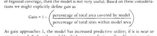
Referred these days as the “Kvamme Gain”, this metric is the de facto measure by which APMs are evaluated… in the case that someone actually evaluates their APM. Snark aside, it is worth noting that APM is a small portion of models in archaeology and only a small portion of APMs are done in a manner (e.g. not ad hoc) by which they can be evaluated. I digress… Kvamme (1988, 327-329) describes the need for a metric that scores a model’s predictions relative to random guessing that is also easy to interpret. Kvamme noted the need for such a metric based on the common practice of only reporting the percentage of site locations correctly classified and not reporting how much area of the model is suggested to contain sites. He noted that it is quite easy to make the perfect predictive model if 100% of the study area is considered likely to contain sites. His goal with the Gain stat was to combine the quantities of percentage of sites correctly classified and the percentage of geographic area predicted as likely to contain sites. Thus:

Kvamme stated that this metric would indicate what was to be gained over random predictions. While there are any number of ways to compare against random chance or a null model, the KG uses the two most often reported and arguably most instructive quantities that result from APM testing; the percentage of the area of the predicted to contain sites and the percent of known sites (or test set sites) that are in that area.
The KG and Kvamme’s ideas on how it fit into model testing are all quite great and were well ahead of their time in archaeology, and many other fields for that matter. It is the only relative constant in APM literature, its simplicity is very attractive, and despite some issues, has served as a useful score.
Binary Classification and the Confusion Matrix
These days, the most common way to discuss the results of a binary predictive model is to use a confusion matrix and the metrics derived from it. The term Confusion Matrix is confusing in and of itself, but it is simply a 2 x 2 table (or n x n for n-class multinomial problems) that compares the predictions versus the observed outcomes for the two classes (i.e. positive or negative, or site-likely and site-unlikely). Put another way, it is the empirical estimates of the joint distribution between two conditions. The word “confusion” is used because it shows where the model “confuses” the two classes.

*Note about the confusion matrix, I do not believe there is a standard for which axis is Predicted and which is Actual. The example here has Predicted on the Y-axis and that is typically what I use, but you will see it both ways.
As seen in the image above, the confusion matrix gives the mutually exclusive counts of True Positives (TP), False Positives (FP), True Negatives (TN), and False Negatives (FN). The sum of these four boxes will equal the total population of data points in your training or test data set. From the four boxes of the confusion matrix, many (too many?) permutations can be calculated. The image below is from the Wikipedia page on Confusion Matrix (note that the axis are switched from the image example above). This graphic shows the most common derivations of metrics from the four quads of the confusion matrix. As you can seen, this seemingly simple contingency table holds a ton of information if you combine the measures into metrics. The same Wikipedia entry has links to explore these metrics further. Of particular note to this post are the basic metrics of Accuracy, Sensitivity, Specificity, and Negative Likelihood Ratio.
https://en.wikipedia.org/wiki/Sensitivity_and_specificity

So clearly, the TP quadrant is the number of observations that your model predicted as positive and they are actually positive in the real world. The FP quadrant is where we got our positive predictions incorrect; TN is where the negative class predictions are correct; and finally FN is where the negative predictions are incorrect. The quantities for these quadrant are calculated from the outcome of a classification model joined to the real-world class labels for each prediction. This can be done for either the training data, to test the predictions of a model on the data used to create it, or test data to test how the model will perform on data it has not yet seen (assumed to be independent of training data). This is all predictive modeling, Machine Learning, and classification 101, so just Google a bit to learn more. Or better yet, read this book! (Introduction to Statistical Learning, James et al. 2015)
Kvamme, the Gain, and the Confusion Matrix
As a threshold based classification metric, the Kvamme Gain can be recast within the framework of the confusion matrix. The benefit to this is that is puts the KG in the same lexicon as metrics used in a diversity of fields and allows for a deeper understanding of its characteristics. The most recent discussion of the KG (except for me in these 1400 page of reports…) by Verhagan (Verhagen 2007:119-125 and reproduced in Kamermans et al. 2009:74-80) goes over some pros and cons of the KG as well as other metrics taken from the APM literature. Verhagen further explores Kvamme’s literature by reviewing the more nuanced approach to model evaluation introduced in Kvamme 1990. Here Kvamme uses a 2×2 contingency table to derive conditional probability and reverse conditional probability; or in other words… a Confusion Matrix. While the term “Confusion Matrix” would have been available in literature in the fields of psychology and computer vision in 1990, it is unlikely Kvamme would have come across them. The term would have been more available in 2007 when Verhagen published about it, but comparing model methods across fields was not his focus either; I digress. Using the 2×2 contingency tables in Verhagen (2007), we can recast his lexicon into the terms of the confusion matrix framework to get a more holistic understanding of the meaning and way in which they can be calculated. Presented below is a comparison of these terms.
| Verhagen | Metric | Calculation |
|---|---|---|
| p_s | Sensitivity, True Positive Rate (TPR), correct site classification |
TP/(TP+FN) |
| p_a | condition positive, site-likely area |
TP+FP |
| P_m|s | Sensitivity, True Positive Rate (TPR) |
TP/(TP+FN) |
| P_m|s’ | False Positive Rate (FPR) | FP/(FP+TN) |
| P_m’|s | False Negative Rate (FNR) | FN/(FN+TP) |
| P_m’|s’ | Specificity, True Negative Rate (TNR) |
TN/(TN+FP) |
| P_s|m | Precision, Positive Predictive Value (PPV) |
TP/(TP+FP) |
| P_s’|m | False Discovery Rate (FDR) | FP/(FP+TP) |
| P_s|m’ | False Omission Rate (FOR), Unexpected Discovery Rate (UDR) |
FN/(FN+TN) |
| P_s’|m’ | Negative Predictive Value (NPV) | TN/(TN+FN) |
| P_s|m/P_s | Positive Predictive Gain (PPG) | PPV/P_s |
| P_s’|m/P_s’ | none | FDR/P_s’ |
| P_s|m’/P_s | Negative Predictive Gain (NPG) | FOR/P_s |
| P_s’|m’/P_s’ | none | NPV/P_s’ |
| Kvamme Gain (KG) | none | 1-(P_m/TPR) |
As much as would like to sit here and write about each and every one of the cells in that table, it is beyond the scope of this post. But what we can draw from that to inform us here is 1) that most of the things Verhagen is discussing have a wikipedia page; and 2) all of these metrics are built from the four elemental components of True Positive (TP), True Negative (TN), False Positive (FP), and False Negative (FN). Since every model that classifies predictions into one of two groups (a binary classification model, like most APM) can be broken down into TP, TN, FP, and FN, than our models can be compared by the same metrics! Further, these metrics can be understood in a context of meaning! Perhaps this is not a revolutionary idea, but if you have spent anytime working with predictive models in archaeology, then you will know that it is not a known practice. As you can see from the table, there are metrics that are further aggregated into other metrics, such as PPV = TP/(TP+FP) and then PPG = PPV/
| APM Metric | Calculation |
|---|---|
| Kvamme Gain (KG) | 1-( /Sensitivity) /Sensitivity) |
| Reach Stat | 1-(FNR/ ) ) |
| Youden’s J (Informedness) | Sensitivity + Specificity – 1 |
Understanding the Kvamme Gain
In the parlance of the confusion matrix the Kvamme Gain statistic equates to:

or using a different terminology:

or finally using the quadrants of the confusion matrix:

These are all way of saying the same thing; one minus the percent of the study area modeled as positive (site-likely) divided by the percent of site-cells correctly classified as positive. The terms Sensitivity and True Positive Rate are synonymous for a measurement of true positives that are correctly identified, e.g. sites or site-present cells that are correctly predicted for. The terms for 


A quick detour: I have in other places described the Gain statistic as 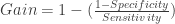


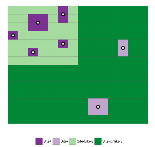
Putting this concept into a landscape perspective, we can view is as in the graphics below where known sites are white blocks and the area we don’t know if we have sites is the purple “background”. If you modeling sites as a point, the dots show where you may take measurements from the centroid. So given this, the point of modeling is to try to find a balance between maximizing the correct prediction of the known site locations while minimizing the area in which you predict those sites. I use the term minimizing loosely here because the degree to which you reduce the are predicted to contain sites depends entirely on the purpose or intent of the model. Reduce it too much and you are just predicting the location location of already known sites and leaving no room for where you may want to reduce it too little and you are in essence just predicting site locations at random. On the other hand, maximizing is pretty much always just that; we want the maximum number of known sites to be correctly classified given the area we are willing to give up/survey. The balance between these two is a critical function of understanding what the model is intended to do.

To follow through on that thought, say we make some model, get our probabilities of site presence/absence, and then threshold that distribution so that we end up with two areas (e.g. Site-likely and Site-unlikely), we end up something like the image below. The green areas are the prediction; light is site-likely and dark is site-unlikely and the known sites are purple with dark being correctly classified and light being incorrectly classified. The entire point of the Kavmme Gain and Youden’s J is to find a single value that embodies this balance between maximizing the correct classification of sites while minimizing the area in which sites are predicted to be.
More to come in part 2!
In the second part of this post, I will dig further into the characteristics of the Kvamme Gain and show that it includes an inherent bias for minimizing the predicted area over maximizing the number of sites correctly predicted. This bias leads to pretty sever problems if one is optimizing their model for the KG. I will posit the Youden’s J (aka Informedness) as a more sensible alternative based on the qualities of being 1) well-known in modeling literature, 2) linear and unbiased, and 3) easily re-weighted to control for the severity of False Negative vs. False Positive errors.
