A More Reproducible Research with the liftr Package for R

Reproducible research… so hot right now. This post is about a way to use “Containers” to conduct analysis in a more reproducible way. If you are familiar with Docker containers and reproducibility, you can probably skip most of this and check out the liftr code snippets towards the end. If you are like, “what the heck is this container business?”, then I hope that this post gives you a bit of insight on how to turn basic R scripts and Rmarkdown into fully reproducible computing environments that anyone can run. The process is based on the Docker container platform and the liftr R package. So if you want to hear more about using liftr for reproducible analysis in R, please continue!

  • Concept – Learn to create and share a Dockerfile with your code and data to more faithfully and accurately reproduce analysis.
  • User Level – Beginner to intermediate level R user; some knowledge of Rmarkdown and the concept of reproducibility
  • Requirements – Recent versions of R and RStudio; Docker; Internet connection
  • Tricky Parts
    • Installing Docker on your computer (was only 3 clicks to install on my Mac Book)
    • Documenting software setup in YAML-like metadata (A few extra lines of code)
    • Conceptualizing containers and how they fit with a traditional analysis workflow (more on that below)
  • Pay Off
    • A level-up in your ability to reproduce your own and others code and analysis
    • Better control over what your software and analysis is doing
    • Confidence that your analytic results are not due to some bug in your computer/software setup

More than just sharing code…

So you do your analysis in R (that is awesome!) and you think reproducibility is cool. You share code, collaborate, and maybe use Git Hub occasionally, but the phrase ‘containerization of computational environments’ doesn’t really resonate. Have no fear, you are not alone! Sharing your code and data is a great way to take advantage of the benefits of reproducible research and well documented in a variety of sources. Marwick 2016 and Marwick and Jacobs 2017 as leading examples. However, limiting ourselves to thinking of reproducibility as only involving code and data ignores the third and equally crucial component; the environment.

Simply, the environment of the analysis includes the computer’s software, settings, and configuration on which it was run. For example, if I run an analysis on my Mac with OSX version something, and Rstudio version 1.1.383, a few packages, and program XYZ installed it may work perfectly in that computational environment. If I then share the code with a co-worker and they try to run it on a computer with Windows 10, Rstudio 0.99b, and clang4, but not rstan and liblvm203a the code will fail with a variety of hard to decipher error messages. The process is decidedly not reproducible. Code and data are in place, but the changes to the computational environment thwart attempts are reproducing the analysis.

At this point, it may be tempting to step back and claim that it is user #2’s prerogative to make an environment that will run the code; especially if you won’t have to help them fix this issue. However, we can address this problem in straightforward way, uphold the ethos of reproducibility, and make life less miserable for our future selves. This is where Docker and containers come into play.

So what is a container?

Broadly speaking, a container is a way to put the software & system details of on one computer into a set of instructions that can be recreated on another computer; without changing the second computers underlying software & system. This is the same broad concept of Virtual machines, virtual environments, and containerization. Simply, I can make your computer run just like my computer. This magic is achieved by running the Docker platform on your computer and using a Dockerfile to record the instructions for building a specific computational environment.

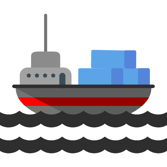
There is a ton about this that can be super complex and float well-above ones head. Fortunately, we don’t need to know all the details to use this technology! The name “container” is a pretty straight ahead metaphor for what this technology does. Specifically a shipping container is a metal box of a standard size that stacks up on any ship and moves to any port regardless of what it carries and what language is spoken. It is a standardized unit of commerce. In that sense, the Docker container is a standardized shipping box for a computer environment that fits in a single file, ships to any computer, and contains any odd assortment of software provided it is specified in the Dockerfile. To this end, the idea is that you can pack the relevant specifics of your computer, software, versions, packages, etc… into a container and ship it with your code and data allowing an end user to recreate your computing environment and run the analysis. Reproducibility at its finest!

Continue reading “A More Reproducible Research with the liftr Package for R”

A More Reproducible Research with the liftr Package for R

A Brief diversion into static alluvial/Sankey diagrams in R

The alluvial plot and Sankey diagram are both forms of the more general Flow diagrams. These plot types are designed to show the change in magnitude of some quantity as it flows between states. The states (often on the x-axis) can be over space, time, or any other discreet index. While the alluvial and Sankey diagrams are differentiated by the way that the magnitude of flow is represented, they share a lot in common and are often used interchangeably as terms for this type of plot. The packages discussed here typically invoke (correctly IMHO) the term “alluvial”, but be aware that Sankey will also come up in discussion of the same plot format. Also, check out @timelyportfolio’s new post on interactive JS Sankey-like plots.

Charles Minard's Map of Napoleon's Russian Campaign of 1812
Charles Minard‘s Map of Napoleon’s Russian Campaign of 1812

Motivation

This post is motivated by a few recent events; 1) I required a visualization of the “flow” of decisions between two models; 2) my tweet asking for ways to achieve this in R; 3) the ensuing discussion within that thread; and 4) a connected thread on Github covering some of the same ground. I figured I would put this post together to address two issues that arose in the events above:

  1. A very basic introduction into the landscape of non-JS/static alluvial plot packages in R.
  2. Within these packages, if it is possible to use ordered factors to reorder the Y axis to change the order of strata.

To those ends, below is a surficial and brief look at how to get something out of each of these packages and approaches to reordering. These packages have variable levels of documentation, but say to say that for each one you can learn a lot more than you can here. However, it is a corner of data vis in R that is not as well known as some others. This view is justified by the twitter and Github threads on the matter. Of course as these packages develop, this code may fall into disrepair and new options will be added.

R packages used in this post

library("dplyr")
library("ggplot2")
library("alluvial")
# devtools::install_github('thomasp85/ggforce')
library("ggforce")
# devtools::install_github("corybrunson/ggalluvial")
library("ggalluvial")
library("ggparallel")

Global parameters

To make life a little easier, I put a few common parameters up here. If you plan to cut-n-paste code from the plot examples, note that you will need these values as well to make them work as-is.

Part of the issue in this post is to look at what ordering factors does to change (or more likely not change) the vertical order of strata. Here I set factor levels to “A”, “C”, “B” and will use this in the examples below to see what using factors does to each plotting function. This order was used because it does not follow either ascending or descending alphabetical order.

A_col <- "darkorchid1"
B_col <- "darkorange1"
C_col <- "skyblue1"
alpha <- 0.7 # transparency value
fct_levels <- c("A","C","B")

Simulate data for plotting

The initial thread I started on Twitter was in response to my need to visualize the “flow” of decisions between two models. One model is the results of a predictive model I made a few years back; these values are labelled as “Modeled” in the data below. The other model is a implementation of the statistical model where individual decisions were made to change predictions or leave them the same; here the implementation is labelled “Tested”. The predictions that were decided upon are simply called “A”, “B”, and “C” here, but these could be any exhaustive set of non-overlapping values. Other examples could be “Buy”, “Sell”, and “Hold” or the like. The point of the graphic is to visually represent the mass and flow of values between the statistical model and the implemented model. Sure this can be done is a table (as the one down below), but it also lends to a visual approach. Is it the best way to visualize these data? I have no idea, but it is the one that I like.

The dat_raw is the full universe of decisions shared by the two models (all the data). The dat data frame is the full data aggregated by decision pairs with the addition of a count of observations per pair. You will see in the code for the plots below, each package ingests the data in a slightly different manner. As such, dat and dat_raw serve as the base data for the rest of the post.

dat_raw <- data.frame(Tested  = sample(c("A","B","C"),100,
                                  replace = TRUE,prob=c(0.2,0.6,0.25)),
                  Modeled = sample(c("A","B","C"),100,
                                  replace = TRUE,prob=c(0.56,0.22,0.85)),
                  stringsAsFactors = FALSE)
dat <- dat_raw %>%
  group_by(Tested,Modeled) %>%
  summarise(freq = n()) %>%
  ungroup()
Table 1 – Simulated Data for Plotting
Tested Modeled freq
A A 7
A B 3
A C 8
B A 25
B B 7
B C 27
C A 8
C B 4
C C 11

ggforce

ggforce (https://github.com/thomasp85/ggforce)

ggforce is Thomas Lin Pedersen’s package for adding a range of new geoms and functionality to ggplot2. The geom_parallel_sets used to make the alluvial chart here is only available in the development version installed from Github. ggforce provides a helper function gather_set_data() to get the dat in the correct format for ggplot; see below.

Ordering – By default ggforce orders the strats (i.e. “A”, “B”, “C”) based on alphabetical order from the bottom up. There is no obvious way to change this default, but I am looking into it.

dat_ggforce <- dat  %>%
  gather_set_data(1:2) %>%        # <- ggforce helper function
  arrange(x,Tested,desc(Modeled))

ggplot(dat_ggforce, aes(x = x, id = id, split = y, value = freq)) +
  geom_parallel_sets(aes(fill = Tested), alpha = alpha, axis.width = 0.2,
                     n=100, strength = 0.5) +
  geom_parallel_sets_axes(axis.width = 0.25, fill = "gray95",
                          color = "gray80", size = 0.15) +
  geom_parallel_sets_labels(colour = 'gray35', size = 4.5, angle = 0, fontface="bold") +
  scale_fill_manual(values  = c(A_col, B_col, C_col)) +
  scale_color_manual(values = c(A_col, B_col, C_col)) +
  theme_minimal() +
  theme(
    legend.position = "none",
    panel.grid.major = element_blank(),
    panel.grid.minor = element_blank(),
    axis.text.y = element_blank(),
    axis.text.x = element_text(size = 20, face = "bold"),
    axis.title.x  = element_blank()
    )

ggforce-1

Continue reading “A Brief diversion into static alluvial/Sankey diagrams in R”

A Brief diversion into static alluvial/Sankey diagrams in R