There are many of ways to look at predictive models. Assumptions, data, predictions, features, etc… This post is about looking at predictions from the feature space perspective. To me, at least for lower dimensional models, this is very instructive and illuminates aspects of the model (aka learning algorithm) that are not apparent in the fit or error metrics. Code for this post is in this gist.

Problem statement: I have a mental model, data, and a learning algorithm from which I derive predictions. How well do the predictions fit my mental model? I can use error metrics from training and test sets to asses fit. I can use regularization and information criteria to be more confident in my fit, but these approaches only get me so far. [A Bayesian perspective offers a different perceptive on these issues, but I am not covering that here.] What I really want is a way to view how my model and predictions respond across the feature space to assess whether it fits my intuition. How do I visualize this?
Space: Geographic Vs. Feature
When I say feature space, I mean the way our data points align when measured by the variables/features/covariates that are used to define the target/response/dependent variable we are shooting for. The easy counter to this is to think about geographic space. Simply, geographic space is our observations measured by X and Y. The {X,Y} pair is the horizontal and vertical coordinate pair (latitude, longitude) that put a site one the map.
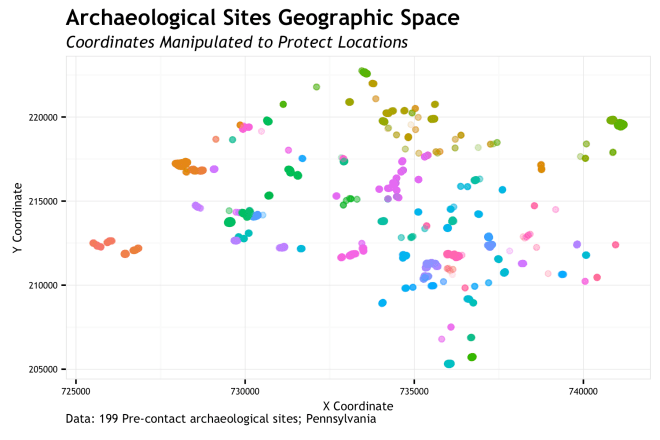
So simply, geographic space is our site sample locations on a map. The coordinates of the 199 sites (n=13,700 total measurements) are manipulated to protect site locations. These points are colored by site.
Feature space? Feature space is how the sites map out based not on {X,Y}, but based on the measure of some variables at the {X,Y} locations. In this case, I measure two variables at each coordinate, 


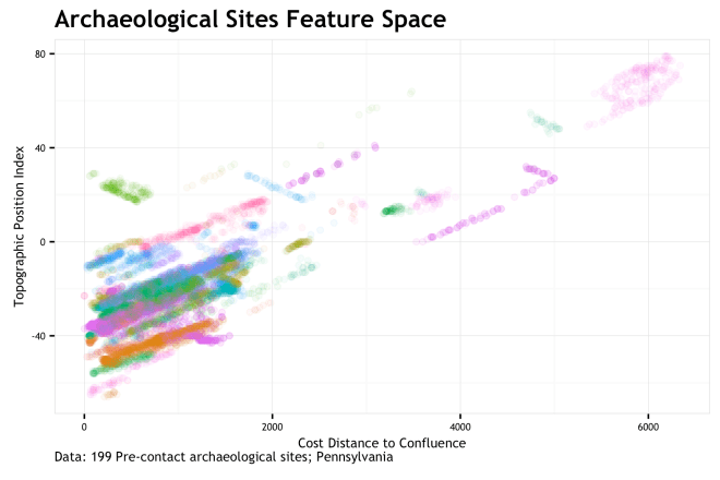
FEATURE SPACE!!!!!!!!! If you are familiar with this stuff, you may look at this graphic and say “Holy co-corellation Batman!”. You would be correct in thinking this. As each site is uniquely colored, it is apparent that measurements on most sites have a positively correlated stretch to them. This is because the environment writ large has a correlation between these two variables; sites get caught up in the mix. This bias is not fully addressed here, but is a big concern that should be addressed in real modeling scenarios.
Either way, feature space is just remapping the same {X,Y} points into the dimension of cd_conf and tpi_250c. Whereas geographic space shows a relatively dispersed site distribution, the feature space shows us that sites are quite clusters around low cd_conf and low tpi_250c. Most sites are more proximal to a stream confluence and at lower topographic positions that the general environmental background. Sure, that makes some sense. So what…

Learning Algorithms
So what does this mean for predictive modeling. Essentially, when you fit a model to site location data, you are fitting it in feature space (or some transformation there of). We measure variables at site locations so that we can transform the sites from geographic space into feature space and then try to draw lines between areas of those features where sites are likely to be present or absent. Without feature space, we are stuck. Consequently, it is very difficult, if not impossible, for the human brain (gray-matter space) to conceptualize more than a small number of points in any more than 2 or 3 dimensions. We need computer and model assumptions for this bit.
So do all learning algorithms fit the feature space the same? NO! Thanks for asking. Different algorithms divide up feature space in different ways. Visualizing how they do this is very instructive as to what the algorithms are “thinking” and how it fits our intuitions of what the feature space should tell us. Seeing the decisions of the algorithm in a visual sense illustrates aspects of the models assumptions and function that may not be apparent at first (second, or third) blush. Ideally, we would all know these aspects prior to implementing a model, but hey… we all start somewhere. You could throw any model/algorithm/classifier at this approach to visualization, but I did it specifically when I was looking into presence-only (one class SVM) and presence-background (MAXENT) methods. I use the other classifiers as a baseline. These are the learning algorithms visualized here:
| Algorithm | R Package |
|---|---|
| Logistic Regression | glm |
| SVM – RBF kernel | e1071 |
| SVM – Polynomial kernel | e1071 |
| SVM – one class | e1071 |
| random forest | randomForest |
| SVM – one class | kernlab |
| Extreme Gradient Boosting | xgboost |
| Maxent | dismo |
Model fit
Its important, but I don’t want to dwell on it. For each of the eight models listed above, I trained and tested with the same data set. This data set is taking the set of 199 recorded archaeological sites, splitting them into 75% training and 25% testing. individual sites are either entirely training or test, therefore no model is tested on the same site that it is trained on. The total number of site-present 10 x 10-meter cells (n = 68,322) is balance by the same number of background cells. This total is then reduced by a factor to sub-sample both present/absent labels to make the computations easier. This has little effect on the outcomes for this purpose. The models are pretty much un-tuned, meaning that they are fit with default parameters. This may not lead to the most optimal predictions, but it will show the predictive response one gets with a default implementation.
The algorithms themselves are a variety of classes. Logistic regression is the canonical example of a classification algorithm. Random Forest and Extreme Gradient Boosting (XGB) are well known ensemble methods that use decision trees to varying degrees to divide the feature space. Support Vector Machines (SVM) are also well-known algorithms which use kernels to re-project the feature space in order to better separate the data classes. The one-class SVMs use only presence observations to find the region where site presence is likely based on the density of the variables/features. Finally, MAXENT is a very popular ecological model that uses site presence and background samples to separate the space and then calibrate probabilities based on site detection and prevalence probability estimates. I don’t want to bog this down with algo-talk, but these briefly discussed characteristics are the things I am trying to visualize below.
But first, some metrics… Root Mean Square Error (RMSE) can be applied to all predictions including the probabilistic and the binary predictions of the one-class SVM classifiers. The second table is for the Receiver Operator Character (ROC) Area Under the Curve (AUC). This can only be applied to the probabilisitic predictions. These, while perhaps not the perfect metric for these problems, are standard and interpretable. The point here is to give a common metric that people recognize and can broadly rank model prediction performance on the 75% training and 25% test set.
| models | RMSE_train | RMSE_test |
|---|---|---|
| GLM | 0.429 | 0.424 |
| SVM RBF | 0.396 | 0.426 |
| SVM Poly | 0.395 | 0.430 |
| SVM OCC | 0.316 | 0.620 |
| RF | 0.368 | 0.444 |
| one-svc | 0.316 | 0.664 |
| XGB | 0.406 | 0.421 |
| MAXENT | 0.426 | 0.432 |
| models | AUC_train | AUC_test |
|---|---|---|
| GLM | 0.807 | 0.816 |
| SVM RBF | 0.839 | 0.811 |
| SVM Poly | 0.843 | 0.797 |
| RF | 0.918 | 0.822 |
| XGB | 0.857 | 0.834 |
| MAXENT | 0.850 | 0.833 |
These metrics suggest that the Logistic Regression model (GLM) achieves the lowest combined error with highest AUC. However, the rest of the classifiers are mostly in the same neighborhood. The one-class SVMs (SVM OCC & one-svc) have notable worse RMSE, but that is not surprising given that they are predicting presence or absence {1,0} and RMSE punishes large errors more than small errors. Therefore any error in these classifiers is an extreme of 1 because it can either be totally correct or totally incorrect.
Predictions in Feature Space
The tables above give a pretty common metric for each classifier and could serve as a gauge for mode selection if you have all your other ducks in a row (sampling, balance, features, cross-validation, theory, and justification), but since this is more of an exploratory analysis of how these modes react to the characteristics of my data, I am more interested in visualizing the predictions in addition to empirical errors.
The components of this visualization that are:
- of interest are the gradient of predicted probability across the full range of the feature space;
- the range of the feature space that my data occupy;
- the location of the train set data;
- the location of the test set data.
In order to do this, I need to figure out the range of my feature space, make a grid of all variable combinations within that space (at a regular interval), make a prediction of all the values of that grid, display it as a raster, and then overlay the other components in a way that makes some visual sense. This was a bit of a challenge visually because of the mixing of a raster with many overlapping points that occupy a small space. To handle this, the background values that represent my potential population are displayed with density contours, whereas the train (red points) and test (green points)sets are points with really high alpha (transparency). Lets see what it looks like!

Logistic regression presents as a nice smooth gradient with highest probability where the TPI and cost distance to a confluence are low. The probability uniformly decreases as these measures increase. Based on the gradients, it is clear that (at least with these data) TPI has more influence on the probability gradient, where as cd confluence has a lower influence. This is visible as high probability as low TPI pretty much regardless of how near/far we are from a confluence. A the TPI increases, the probability decreases pretty quickly. All in all, this is a pretty nice mildly biases, but low variance surface that seems to generalize pretty well. Some sites will be poorly predicted for, but may are not. Plus, it fits my intuition of how these variables should correspond to probability.

The Radial Basis Function (RBF) SVM is run with the defaults of the classifier, but they are pretty sensible. It is quickly obvious that the non-linear nature of this classifier is evident in our feature space. Compared to the logistic regression, this classifier (with these parameters and data) has a lower bias and greater variance. This is particularly evident in the higher probability cluster that is at the extreme of my population. That cluster of red dots at {~3,~2.5} is far out for all sites (positive class) as well as the generally environmental background. Is this overfit or a real cluster of sites on a landform that should be high probability? Are these training sites out there an outlier or real? This classifier begs those questions of our data. For the main body of positive points, the high probability region is pretty tightly fit where my experience would expect to see it.
The SVM with polynomial kernel (defaults) was very similar in appearance, so not need to repeat.
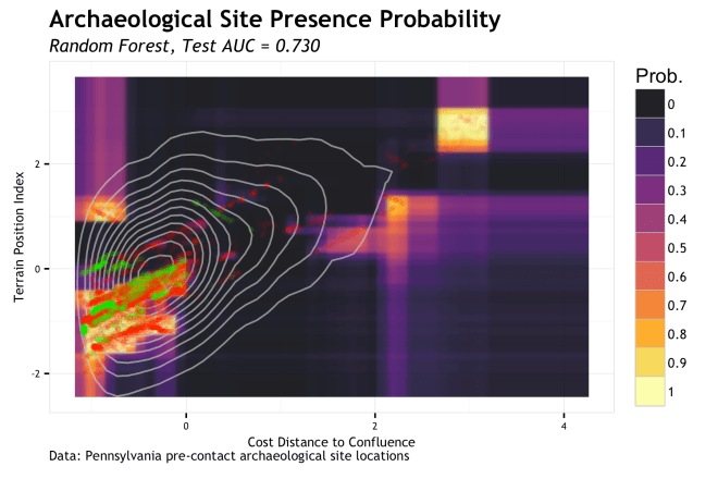
The random forest algorithm uses many decision tree structures applied to randomized bootstrap data sets and variables to partition the feature space. Think of a single decision tree split as a rule, e.g. probability increases < TPI = 0 > probability decreases. With this rule, a horizontal line would be drawn at TPI = 0 and the space below it would be some higher probability and above the line would be some lower probability; the space is partitioned with a straight line. Now do that for both variables across 500 decision trees of randomized data and you begin to understand how the boxy prediction surface forms. Imagine further that you keep growing each decision tree so that there are rules on rules on rules that further partition the space in finer and finer regions. Run that out and you can see how you get random forests to overfit. The particular run here uses 500 total decision trees, but their depth is restricted to stopping when the branches are down to no less then 100 data points. The larger the number of data points in each end node effectively restricts the tree depth and generalizes the predictions. This classifier picks up the same potential outliers as the SVM, but boxes them in a bit more. I’d worry this is overfitting a bit and work on optimizing the hyperparameters for more generalization (and work on my data to find out what is outlier and what is real).
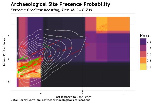
Extreme Gradient Boosting (XGB) is somewhat like random forest in that decision trees are use for segmenting the feature space, but the way they are used is a good bit different. In short, the decision trees are held to a depth of one split (decision stumps) and the multiple rounds of learning follow a gradient that applies a higher learning rate to misclassifications of the previous round. It is a really smart algorithm and has performed very well for me once the hyperparameters are learned. Either way, the linear partitioning of space is evident. The implementation of XGB here leads to a more generalized partitioning of the same regions identified by random forest; this is probably a good thing.
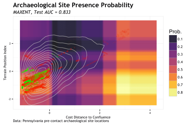
Well MAXENT sure gets interesting… To be honest, I had ignored MAXENT for a long time because I could not get a semi-clear understanding of what it was doing. I have circled back around now that I read some other papers on it. Seeing these results intrigues me even more. The test AUC is amongst the highest and the test RMSE is average’ish. The partitioning of space is not unlike random forest or XGB, but a bit more generalized. The main body of positive observations is captured, and some outliers. There is only a few small regions that suggest very low potential. I say potential, because as I understand it, MAXENT is estimating 
One-Class Classifiers
As briefly discussed, one-class classifiers only use presence (positive class) data to define a hypersphere region that encloses those points and allows for the misclassification of “outliers”, the amount of which is controlled by a “slack” variable. Now, for the conceptualization of archaeological predictive modeling, this approach is very interesting (but will take another post to get deep into). There are also drawbacks to this such as the information lost in background and absence locations. But, here is how it looks…

The above plot is the presence region of the one-class SVM with the e0171 package with 

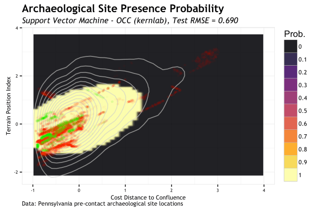
Finally, the final plot is the one-class SVM using the kernlab package with the same
Conclusions…
Being able to visualize the logical implications of model characteristics was pretty enlightening to me. Generally, the models followed the sort of basic structure I would assume from the way they work, but the nuances derived from the data were really interesting. Sometimes a model fit can give you all the right metrics and make you feel pretty comfortable, but when you see it geographic space, it makes you skeptical. As we have seen here, looking at the model in feature space gives you a new avenue for critiquing a model. If you model doesn’t have a geographic space, this may be more useful. Of course, we can only look at 2 or maybe 3 dimensions of the feature space and it is very instructive to use marginal plots of single variables to see how they respond when others are held constant or integrated over. However, this is but another tool to use to peer into the mechanisms that we use to gain a better understanding of the world around us.
Notes…
- All the code for this is in this GIST
- I noticed this link from Reddit this morning which similarily compares classifiers in feature space. Pretty cool. [note, their Maxent classifier is different from the MAXENT classifier used here…]
- I cannot release the location data, but there is a bit of code to simulate a non-spatially dependent version that can be used to run the rest of the code.
- These models are basically un-tuned. There was a slight bit of optimization, but not much. The point of the post was not to produce the best fits I could, but to find a way to see how they respond continuously across bivariate feature space.
- The plots are a little hideous, but with these plots the intention is for consumption by the modeler, not the conveyance of complex information distilled into a succinct graphic representation. These plots are for the modeler to better understand the model; then go off to make better models, derive understanding, and make great graphics of that.
- Yes, there is massive spatial dependency in this data and the variables are correlated.
- The coordinates in the first figure are monotonically transformed to retain association, but hide the true location of the data points. This is required by the data custodian as a condition of use.
- In some cases the training error is higher than the test error. This is a red flag to me that something is up. Since the data has a spatial covariate structure, some data splits can lead to this behavior. It is a symptom of the sampling issues with discontiguous areal data sampled on a regular point grid. Its part of the problem of archaeological site data and needs to be addressed.

[…] the last post, I talked about showing various learning algorithms from the perspective of predictions within the […]
LikeLike