In archaeology, there is a strong need and desire to project our understanding of where we know sites are located to areas where no one has yet looked for sites. The practical extension of this desire is to use this technique to better protect and manage archaeological sites by identifying areas that have a heightened sensitivity to the potential for archaeological material. Such an approach is necessary because time and funding will seldom allow archaeologists to survey 100% of a study area. The manner in which observational data is projected onto the broader landscape can take on many forms; qualitative and quantitative. The universe of approaches to do so are typically considered under the umbrella of “Archaeological Predictive Modeling” (APM).
This blog will contain many different takes on APM and discuss many different techniques. As a first post, what follows is a description and code for the most basic and most commonly employed form of quantitative APM; the Arbitrary Combined Weights model (ACW). Simply, the ACW model assigns quantitative weights to values of one or more explanatory variables that are then combined in some mathematical form in order to signify a relative level of archaeological sensitivity. Typically, a continuous variable is binned based on its characteristics (e.g. quantiles, natural breaks) or based on the investigators experience and a weight of sensitivity is assigned to each bin. Discreet variables may have assigned to each class or groups of class. The assigned weight may be may be on any scale, such as 0 to 1 or 0 to 100, but almost always consider a greater weight value to indicate a higher sensitivity for archaeological material. Weights may be assigned indicate the sensitivity of each bin individually or distributed across the bins relative to each other.
Once weighted, the combination can take any arithmetic form that fits the models intention. The most common ways to do so include summing weights or averaging weights. Many other linear combinations are possible and include adding a higher level of weights to each variable. As such, the weights within a variable are adjusted relative to the overall importance the investigator places on each variable as a whole. The overall point goal of this method is to identify the intersection of variables that contain the highest combination of weights and ostensibly, the highest sensitivity for archaeological material. The method described here is essentially the very basic Weighted Sum Model used in the Multi-Criteria Decision Analysis field. That is a decent place to explore.
Clearly, the ACW method is very unstructured and leaves a great deal of room for error and interpretation. Despite this, it is so commonly used because it is easy to describe, easy to implement with or without GIS, and coherent with our basic conceptual models of site distribution. With this ease comes many reasons why ACW is a poor representation of archaeological sensitivity, highlighted by the arbitrary nature of bins and weights, ad hoc arithmetic, lack of a measure for variable contribution, and no inferential ability to state a few. However, despite a laundry list of theoretical and quantitive incompatibilities, the ACW model will continue to be extensively used throughout archaeology and deserves analysis. This post implements a schematic version of the ACW model in R code and explores some of the output. This post will be followed up by deeper exploration and extensions of this basic model.
This code does most of the work with base R functions, but uses ggplot2, reshape2, and scales in order to format data for plotting
require(ggplot2)
require(reshape2)
require(scales)
## Loading required package: ggplot2
## Loading required package: reshape2
## Loading required package: scales
The first step here is to create a table of the bins and weights for each of three variables, h20_cls for distance in a water source in meters, slp_cls for percent topographic slope, and soil_cls_lbl for soil drainage class. The objects of h20_wgt, slp_wgt, and soil_wgt are the weights associated to each bin. For example a weight of 0.85 is assigned to distances of 0 to 100 meters from a source of water. A weight of 0.95 is assigned to slopes between 0% to 3%, followed by a weight of 0.85 for slopes of 3% to 5%.
# weights as probability within bin
h20_wgt <- c(0.85, 0.75, 0.45, 0.25, 0.1)
h20_cls <- c(0,100,300,500,900,9999)
slp_wgt <- c(0.95, 0.85, 0.65, 0.2, 0.1)
slp_cls <- c(0,3,5,8,15,999)
soil_wgt <- c(0.30, 0.65, 0.85)
soil_cls <- c(-1,0,1,2)
soil_cls_lbl <- c("poor", "moderate", "well")
As described in the model methods above, the bins and weights and bins are based on the judgement of the investigator and likely have grounding in real-world observation, they are not directly resulting from an analysis of a set of known site locations. The explicit use of known sites to derive bin widths or weights are considered proportionally weighted models.
Example of Weights: Distance to Water Source
| from |
to |
weight |
| 0 |
100 |
0.85 |
| 100 |
300 |
0.75 |
| 300 |
500 |
0.45 |
| 500 |
900 |
0.25 |
| 900 |
9999 |
0.1 |
Next, I simulate some environmental data to apply my weights to. Typically, this would be done by extracting raster cell values or by using the raster calculator in a GIS program. The variables below draw values of slope and h20 distance with an exponential probability to simulate the high correlation that is often found in nature. In R, the raster package can be used to extract values from rasters and preform the following analysis.
# simulate a landscape. this would typically be enviro rasters
slope_sim <- sample(seq(0:100),1000, replace = TRUE, prob = dexp(seq(0:100),0.1))
h20_sim  <- sample(seq(0:5000),1000, replace = TRUE, prob = dexp(seq(0:5000),0.005))
soil_sim <- sample(c(0, 1, 2), 1000, replace = TRUE, prob = c(0.25, 0.5, 0.25))
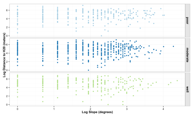
The plot below shows the distribution and correlation of simulated data points for log slope and log water, faceted by soil drainage.
(code for above plot)
sim_landscape <- data.frame(slope = slope_sim, h20 = h20_sim,
                            soil = factor(soil_sim, labels = soil_cls_lbl))
ggplot(data = sim_landscape, aes(x = log(slope), y = log(h20), color = soil)) +
  geom_point() +
  facet_grid(soil~.) +
  theme_bw() +
  ylab("Log Distance to H20 (meters)") +
  xlab("Log Slope (degrees)") +
  theme(legend.title = element_blank(),
        legend.title = element_blank(),
        axis.title = element_text(face = "bold"),
        strip.text.y = element_text(face = "bold", size = 12),
        strip.background = element_rect(colour = "gray10", fill = "gray90"),
        legend.position = "none") +
  scale_color_brewer(palette="Paired")
Then distribution of values extracted from the explanatory rasters are then recoded to the weight values based on the predetermined bins. The cut function is used to recode. as.numeric(as.character(.)) is used as a bit of a hackey way to convert the factors resulting tom cut back to numeric values.
# reclass vector
h20_reclass     <- cut(h20_sim, breaks = h20_cls, labels = h20_wgt)
slope_reclass <- cut(slope_sim, breaks = slp_cls, labels = slp_wgt)
soil_reclass <- cut(soil_sim, breaks = soil_cls, labels = soil_wgt)
h20_reclass   <- as.numeric(as.character(h20_reclass))
slope_reclass <- as.numeric(as.character(slope_reclass))
soil_reclass <- as.numeric(as.character(soil_reclass))[

var_matrix <- data.frame(slope_wght = slope_reclass,
                         h20_wght = h20_reclass,
                         soil_wght = soil_reclass)
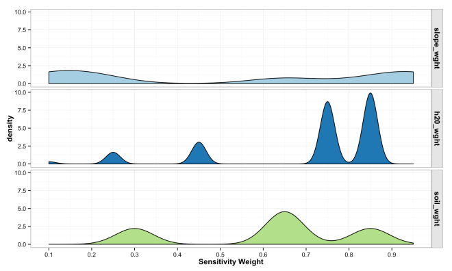
The plot below shows the destiny of weight values across each variable from the simulated landscape. Notice the peaked density for high sensitivity values of distance to water compared to generally low density and even densities for slope. This results form the interaction of arbitrary weights, bins, and the nature of the landscape being modeled.
(code for above plot)
var_matrix_melt <- melt(var_matrix)
ggplot(data = var_matrix_melt, aes(x = value, fill = as.factor(variable))) +
  geom_density(binwidth = 0.05) +
  xlab("Sensitivity Weight") +
  facet_grid(variable~.) +
  theme_bw() +
  theme(
    legend.title = element_blank(),
    axis.title = element_text(face = "bold"),
    strip.text.y = element_text(face = "bold", size = 12),
    strip.background = element_rect(colour = "gray10", fill = "gray90"),
    legend.position = "none")+
  scale_fill_brewer(palette="Paired") +
  scale_x_continuous(breaks=seq(0,1,0.1))
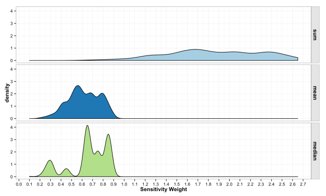
The final step in the model is to combine the weights across variables in to form an overall sensitivity value. As described above, this can be done in any numbers of ways, but typically is a simple sum or mean of weights. There is little guiding theory to help inform what should be done here, but the intention is to show locations where more desirable attributes intersect. Mean and Median have some attraction because the final sensitivity is on the same [0,1] scale. However, these turn into essentially sample means/medians and have a Central Limit Theorem effect where all values trend toward the mean. This is because the are many likely ways to combine values to equal 0.5, but many fewer likely combinations that equal 0.9. Summing the values has a similar issue and also changes the scale of the combined sensitivity based on the number of variables in the model. These issues are some of the most important to understand if working with ACW. The plots below show how the final sensitivity value distribution changes based on the method used to construct it; Sum, Mean, or Median.
# calculate aggregations of sensitivity values
var_matrix$sum <- apply(var_matrix[ , 1:3], 1, sum)
var_matrix$mean <- apply(var_matrix[ , 1:3], 1, mean)
var_matrix$median <- apply(var_matrix[ , 1:3], 1, median)
(code for above plots)
results_melt <- melt(var_matrix[,c("sum","mean","median")])
ggplot(results_melt, aes(x = value, fill = as.factor(variable))) +
  geom_density() +
  xlab("Sensitivity Weight") +
  facet_grid(variable~.) +
  theme_bw() +
  theme(
    legend.title = element_blank(),
    axis.title = element_text(face = "bold"),
    strip.text.y = element_text(face = "bold", size = 12),
    strip.background = element_rect(colour = "gray10", fill = "gray90"),
    legend.position = "none")+
  scale_fill_brewer(palette="Paired") +
  scale_x_continuous(breaks=seq(0,3,0.1))
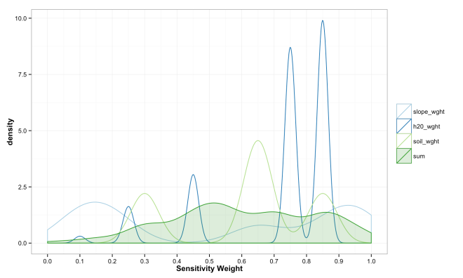
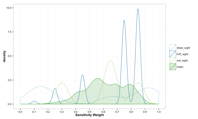
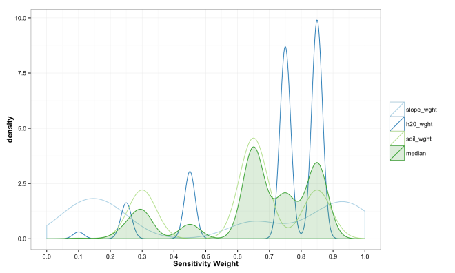
These final plots illustrate the densities of final weights for the various combination methods relative to the weights of each variable. Notice the the sum method produces a more diverse range of values that peaks towards 0.5, which is a region of low density for all three variables. The mean function of sensitivities results in a similar pattern, but less dispersed, yet still aggregated towards the center. Finally, the median function of aggregation has a higher fidelity to the peak densities of weights per each variable. Which of these is the best method is the best? Well, there is probably not a good answer to that beyond either your theory or cross-validated prediction error. However, if you had the former you would probably not use the ACW model because there are better approaches to model theories, and if you attempted the latter you would have a larger data set and could use statistical models with a better mathematical foundation. That being said, there are times when small amounts of data, limited amounts of time, and the need to convince a skeptical audience require a model that is easy to create and explain; such as the ACW model. Much more on this at a later date.
(data munge for above plots)
compare_weights_plot <- rbind(results_melt, var_matrix_melt)
compare_weights_plot$variable <- as.character(compare_weights_plot$variable)
compare_weights_sum_plot <- compare_weights_plot[which(compare_weights_plot$variable %in%
                              c("slope_wght","h20_wght","soil_wght")),]
compare_weights_sum <- compare_weights_plot[which(compare_weights_plot$variable %in%
                              c("sum")),]
compare_weights_sum$value <- scales::rescale(compare_weights_sum$value,to = c(0, 1))
# function(x){(x-min(x))/(max(x)-min(x))}
compare_weights_sum_plot <- rbind(compare_weights_sum_plot, compare_weights_sum)
compare_weights_mean_plot <- compare_weights_plot[which(compare_weights_plot$variable %in%
                              c("mean","slope_wght","h20_wght","soil_wght" )),]
compare_weights_median_plot <- compare_weights_plot[which(compare_weights_plot$variable %in%
                              c("median","slope_wght","h20_wght","soil_wght")),]

compare_weights_sum_plot$variable <- factor(compare_weights_sum_plot$variable,
                        levels =  c("slope_wght","h20_wght","soil_wght","sum"))
compare_weights_mean_plot$variable <- factor(compare_weights_mean_plot$variable,
                        levels =  c("slope_wght","h20_wght","soil_wght","mean"))
compare_weights_median_plot$variable <- factor(compare_weights_median_plot$variable,
                        levels =  c("slope_wght","h20_wght","soil_wght","median"))
(code for above plots)
ggplot(data = compare_weights_sum_plot, aes(x = value, color = variable,
                                             fill = variable, alpha = variable)) +
  geom_density() +
  scale_alpha_manual(values = c("0","0","0","0.2")) +
  xlab("Sensitivity Weight") +
  theme_bw() +
  theme(
    legend.title = element_blank(),
    axis.title = element_text(face = "bold"))+
  scale_fill_brewer(palette="Paired") +
  scale_color_brewer(palette="Paired") +
  scale_x_continuous(limits=c(0, 1), breaks=seq(0,1,0.1))
ggplot(data = compare_weights_mean_plot, aes(x = value, color = variable,
                                             fill = variable, alpha = variable)) +
  geom_density() +
  scale_alpha_manual(values = c("0","0","0","0.2")) +
  xlab("Sensitivity Weight") +
  theme_bw() +
  theme(
    legend.title = element_blank(),
    axis.title = element_text(face = "bold"))+
  scale_fill_brewer(palette="Paired") +
  scale_color_brewer(palette="Paired") +
  scale_x_continuous(limits=c(0, 1), breaks=seq(0,1,0.1))
ggplot(data = compare_weights_median_plot, aes(x = value, color = variable,
                                             fill = variable, alpha = variable)) +
  geom_density() +
  scale_alpha_manual(values = c("0","0","0","0.2")) +
  xlab("Sensitivity Weight") +
  theme_bw() +
  theme(
    legend.title = element_blank(),
    axis.title = element_text(face = "bold"))+
  scale_fill_brewer(palette="Paired") +
  scale_color_brewer(palette="Paired") +
  scale_x_continuous(limits=c(0, 1), breaks=seq(0,1,0.1))

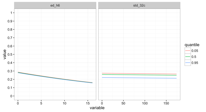


, but the response is pretty much the same. The uncertainty of 1000 posterior draws of a single 3:1 background sample is presented here:


 desktop GIS was just getting off the ground. As such, model output that use ASCII characters as indicators of raster quantities was very cool for its day. Still pretty cool in a retro sort of way. While the modeling methods may seem outdated, the content in every chapter is well worth the read. If not only for learning the information the first time, but also for understanding the basis for most of the APM literature from the decades to follow.