TL:DR
The punchline: It appears that firstly, the metric of Pokémon CP is correlated directly to HP with few, if any, other related metrics. Secondly and perhaps more interestingly, that the post_evolution CP increase is a random draw from a parameterized beta distribution centered on a CP percent increase specific to each Pokémon species. Let me explain…

Ok, this is a bit odd. Before last month, all I knew of Pokémon was a yellow thing called Pikachu and something about a card game. Then Pokémon Go came out a few weeks ago, and I decided to check it out. Now I am an avid player and find the intricacies quite interesting; in addition to the psychology of the game play. I don’t spend too much time reading the internet about the game, but it is fun to merge the game with an analysis. The following post is akin to an Exploratory Data Analysis (EDA) of the data; not a full inference or comprehensive study. The full code for this analysis can be found at this Gist.
Why bother?
The ever enjoyable Data Machina email newsletter included a link to a Pokémon dataset on OpenIntro in the last edition and I followed it down the rabbit hole. This data set contains the observations of a number of measurements of a specific Pokémon species before and after a series of evolutions. For non-Poké people, one goal of the game is to collect Pokémon and then evolve them into more powerful forms. The metric for “more powerful” is the Combat Power (CP). Like many things in this game, the mechanism behind how the CP is calculated and effected by evolution is unknown. However, I am sure a quick Google search will turn up plenty of ideas. The purpose of the data set on OpenIntro is to look at these variables and try to discover how the CP is modified by an evolution. The end game to that quandary is to more efficiently select the best Pokémon to spend your limited resources on to evolve. The final chapter is this narrative is that a more efficiently evolved Pokémon will allow you to be more competitive in gym battles and therefore represent your team (one of Blue, Yellow, or Red), gain Pokémon coins, and attract more rare Pokémons. If a little insight on how the underlying mechanism of CP works gets you there faster, all the better.

The intent of the posting of this data set on OpenIntro is to see if the provided variables contribute meaningfully to the data generating mechanism of the CP relative to evolutions. As stated on the site:
A key part of Pokémon Go is using evolutions to get stronger Pokémon, and a deeper understanding of evolutions is key to being the greatest Pokémon Go player of all time. This data set covers 75 Pokémon evolutions spread across four species. A wide set of variables are provided, allowing a deeper dive into what characteristics are important in predicting a Pokémon’s final combat power (CP).
Example research questions: (1) What characteristics correspond to an evolved Pokémon with a high combat power? (2) How predictable is CP from an evolution?
Good questions. The analysis that follows takes a quick look at Q1, concluding that most of the action is in the HP and few other variables. Question 2 is the more direct focus of this post, but I formalized the question a bit: What accounts for the variation in CP gain per evolution within a given species?
The Data
The data from OpenIntro is pretty limited; no Big Poké Data here. There is a total of 75 observations from pre and post-evolutions of Pokés from four different species. The species are an important distinction. This analysis will recognize the variation between species, but try to find a universal model that fits all species. Note the difference in sample size between species. The uncertainty of small sample size has an important effect here.
> colnames(pokedat)
[1] "name" "species" "cp"
[4] "hp" "weight" "height"
[7] "power_up_stardust" "power_up_candy" "attack_weak"
[10] "attack_weak_type" "attack_weak_value" "attack_strong"
[13] "attack_strong_type" "attack_strong_value" "cp_new"
[16] "hp_new" "weight_new" "height_new"
[19] "power_up_stardust_new" "power_up_candy_new" "attack_weak_new"
[22] "attack_weak_type_new" "attack_weak_value_new" "attack_strong_new"
[25] "attack_strong_type_new" "attack_strong_value_new" "notes"
>
| Species | Count |
|---|---|
| Caterpie | 10 |
| Eevee | 6 |
| Pidgey | 39 |
| Weedle | 20 |
Thinking about the data and the two questions above, my interest turned towards univariate correlation between the variables offered figuring out that the real metric is. Diagnosing correlation would be a visual approach that offers an understating of what is moving in-step with what. Of course “correlation is not… ” and all that, but it sure as heck doesn’t hurt when you are trying to develop a data generating model. The metric of interest is not only the pre and post-evolution CP (cp and cp_new respectively), but some permutation of that incorporated the fact that species seems to have a big effect on the output.
pokedat <- as_tibble(read.csv("pokemon.csv")) dat1 <- mutate(pokedat, delta_cp = cp_new - cp) %>% # net change in cp # the % change in cp from old to new mutate(pcnt_d_cp = delta_cp / cp) %>% # group by species to calculate additonal varaibles group_by(species) %>% # species grouped mean percent change mutate(spec_mean_pdcp = mean(pcnt_d_cp)) %>% # species grouped std dev of % changes from old to new cp mutate(spec_mean_pdcp_sd = sd(pcnt_d_cp)) %>% # difference in % delta cp (pdcp) change from species group mean mutate(cent_spec_mean_pdcp = pcnt_d_cp - spec_mean_pdcp) %>% # z score for pdcp change within species group mutate(z_spec_mean_pdcp = cent_spec_mean_pdcp / spec_mean_pdcp_sd) %>% data.frame()

the modification of the data in the code above spells out the development of the desired metric. Since with are talking about an evolutionary process, the desired metric has to do with chance in states. In this case the change from pre to post-evolution CP; referred to at the delta CP. Further, since we have multiple species (and there are many more than four in the Pokémon universe), we consider delta CP relative to the mean of each species. Finally, as each species has a different range of CP as some species are more powerful than other, it is good to look at the percent change per species, as opposed to an absolute CP increase. Based on these observations, the desired metric is based on the Percent Delta CP (PDCP) per species. The metric is the PDCP and it is considered relative to each species; or spec_pdcp. This is the metric that we seek to identify a data generating mechanism for.
Correlation = Where’s the party?

The pairs plot above is clearly not a good visual communicator of information, but on the back-end, it helps me look over the variables and see what is interacting with what on a 2 dimensional scale. Clearly there could be deeper interactions in the data that are masked, but for an EDA, it is a good first approximation of relationship. And what relationship was there to see? Not much. Essentially, the visual inspection showed few trends relative to CP and PDCP. The closest tracking to CP is clearly HP, although some of the other variables are closely matched. These variables (e.g. cp_new and power up candy related) have a higher correctional, but when thinking about how they fit into a generative system, they cannot be justified. Sure the amount of candy needed to evolve is related to CP, but it is not explanatory, it is a species specific constant that is just correlated to CP. Now if height or weight was highly correlated, that would be very interesting.. alas it is not.
The correlation plot below depicts the correlation for the continuous numerical variables in the data set, including those I created as features. This plot is ordered using the hclust algorithm. This is used to order the variables according to a hierarchical clustering of correlation. What does it show? Well, The things that should be correlated, CP, delta_cp, HP, other other features I calculated are correlated. The other more natural correlation pcnt_d_cp (aka PDCP) includes the attack_weak_value; the damage done by the pre-evolution weaker attack. Its a little hard to conceptualize how the damage done by weak attack would be used to generate a new CP, plus an ANOVA model comparison between the NULL model and one with the attack_weak_value has a p-value of 0.608. It does not seem to account for much variance in the PDCP, but could be worth looking into later.

c2 <- corrplot(c2, method = "square", order = "hclust", tl.col = "black", tl.cex = 1.5)
An unrelated, but interesting note is the negative correlation between weight and a few variables (including weight_new???). A quick plot shows that there is generally a positive trend here, but a few incredibly heavy Pidgeys mess up the data. The lot of 30 Kg Pidgeys may be a data error, but certainly illustrate that correlations need to be vetted.

CP and HP
While it is hard to imagine how the correlation between HP and PDCP (and to a greater extend cp_new and delta_cp) would have an effect on the generation of PDCP, a glance into their relationship is warranted. First, a view of the descriptive data by species.
| species | Mean_CP | Mean_HP |
|---|---|---|
| Caterpie | 131.70 | 40.20 |
| Eevee | 553.00 | 69.33 |
| Pidgey | 194.72 | 37.33 |
| Weedle | 127.95 | 38.90 |
The correlations in the table below (r value) are the same as those in the correlation matrix above. Clearly, there is a strong correlation between CP and HP across all species, but less so for Eevee. Throughout this analysis, Eevee is always our problem child. Eevee is the smallest sample size, but also the highest CP. We’ll see more of Eevee later. The r^2 values, Coefficient of Determination, represents the proportion of variance within the distribution of CPhat is explained by HP. Again Eevee is messing us up here a bit, but the other r^2 values are quite strong.
| Species | r | r^2 |
|---|---|---|
| Caterpie | 0.90 | 0.81 |
| Eevee | 0.77 | 0.59 |
| Pidgey | 0.97 | 0.95 |
| Weedle | 0.95 | 0.90 |
Basically, a ton of the variation we see in CP across species is “explained” by HP values. This is not claiming that HP is the cause of CP; it may be the other way around… However, laking other variables that make sense in a generative way, it looks as if choosing a Pokémon to evolve is simply the one with the highest HP and few if any other variables matter. This is no surprise to this, but perhaps it resolves some of the mystery that things like weight or height make a difference in post-evolution CP. Caveats being that having an extra small (XS) Pokémon has different limitations on ultimate HP levels, that there is a chance that evolving under some conditions may lead to XS Pokémons, and that CP may drive HP; but I don’t think that is the case.
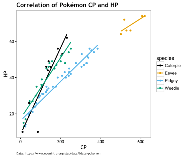
Visually, the correlation and variation between species is pretty obvious. To answer question #1, this is about it… There is not much to say based on the data we have at hand. Could there be other variable out there driving both HP and CP; sure why not? On the other hand, maybe CP and by relation HP, are derived from a mechanistic process that doesn’t depend much on other variables. Perhaps CP and HP evolution algorithmically without the need for co-variates and variance in PDCP is a latent variable. The rest of this post will seek to define what this algorithmic approach may be like.

Algorithm Defining Variation in PDCP
As explained earlier, PDCP is the percent delta (change) in CP from pre to post evolution. Within each species, the PDCP ranges around a bit. If the algorithm was simply to evolve each species by x percent, then PDCP would have not variation. That is not the case, although the variation in PDCP is rather tame. By centering the PDCP per species, we can see how the measure varies around a mean PDCP for that species. If this variation can be parameterized and fit within a distribution, then we have the makings of an algorithm to derive post-evolution CP. I’ll drop my suggestion for that algorithm here and explain it as we go:
- Establish a target percent pre to post-evolution change in CP for each species. This is the species mean PDCP.
- Parametrize a distribution that is sampled to derive the variation from that mean PDCP. This is the centered species mean PDCP.
- For each evolution,
CP_newis equal to the original CP multiplied by 1 * species mean PDCP + variation
Expressed as:

Where 


This algorithm is straightforward and everything is given with the exception of

Characterizing Variation
As touched on earlier, we are not dealing with a natural system here (as much as I want to think Pokémon are real); this is more akin to reverse engineering IMO. The game designers went above and beyond with this thoughtful game, but stuff like how CP evolves is still only a decision that is made by an engineer/programmer and is constrained to be simple by many factors (bandwidth, latency, code complexity, time, etc…). The algorithm proposed above, or some variation thereof, is justified as a plausible approach to me because of its simplicity and logical approach. Assign each species a standard % CP increase then vary it by adding/subtracting a bit based on a distribution, and we’re done. The trick here is to find out what the distribution is of CP around the species mean (measured here as PDCP). If the family and parameters of that distribution can be found, then we have a valid model for predicting the range of post-evolution CP.
From the data at hand, we can get a quick visual estimate of the distribution PDCP by centering it relative to each species. Aside from that darn small sample Eevee the others look to hold pretty close to their species mean and drop of with some symmetry on either side.

Looking at in a different way, here are the distributions of the data points centered on species mean.

Clearly , Eevee has the largest amount of variation here. While I continue to point to the small sample size of Eevee as an issue, I acquiesce that it is worth while to explore taht variation and see if it can be accounted for. However, I am not going to mess with that here. I am going to continue with a model that treats all species the same except for the mean % CP increase. If a species specific model exists, I would like to at least test a universal model first to establish a base line. In order to do so, I need to use that data sample above to characterize the population from which they may have been drawn.
Hello? Are you my distribution?
The centered PDCP appeared to be somewhat symmetrical, but had a slight bias to the positive side. To test for a fitting distribution, I will look at the centered PDCP as a set of absolute values.

Fitting a distribution to data is the procedure by which one takes empirical data and using a variety of methods approximates the probability distribution that generated the data with an associated degree of likelihood. There are many ways to do this, including parametrically or non-parametrically. The parametric approach, used here, estimates the parameters of a given univariate distribution to best approximate your data via Maximum Likelihood Estimation (MLE), Maximum Goodness-of-Fit estimation (MGE), or a handful of other metrics. Smart people may roll-their-own method, but I will use the fitdistrplus R package [CRAN] to do it for me.
For a quick and dirty suggestion of potential population distributions, the descdist() function is used to describe the data distribution relative to skewness and kurtosis. Based on these measures, 1000 bootstrap samples are drawn and compared to a handful of common distributions (see legend in plot below). The observed data is plotted along with the outcome of the estimates for the common distributions. As evident in the plot Cullen and Frey graph below, our data fits within the cone of the beta distribution bootstraps, but not particularly close to the other distributions. Note: the steps that follow were tested with a normal distribution on the data on the original scale (not absolute values) and was pretty clearly not the correct distribution. The divergent linear patterns in the bootstrap estimates of our data (orange circles) is most likely species specific. The conforming of the bootstraps to the beta distribution cone is a good indicator that the process for fitting should take a look at the beta.
f3 <- fitdist(abs(dat1$cent_spec_mean_pdcp),"beta") # plot boostrapped common distributions relative to data for comparison descdist(abs(dat1$cent_spec_mean_pdcp), boot = 1001) # save via quartz, may not work on Windows quartz.save(file = "Cullen_Frey_graph.png", height = 5, width = 6, type = "png", device = dev.cur(), dpi = 300)

The beta distribution is a series of continuous probability distributions bound by [0,1]. It has two parameters, 

shape1 and shape2 . The intution of the beta distirbution is that it is a distribution of porbabilities. To get a good feel for this, read David Robinson’s epic StackOverflow post on the beta distribution. The use of this distribution makes some sense here as we are looking for a distribution of percentages bound by [0,1].

> summary(f3)
Fitting of the distribution ' beta ' by maximum likelihood
Parameters :
estimate Std. Error
shape1 0.5663097 0.07724683
shape2 15.6822581 3.15120078
Loglikelihood: 186.0615 AIC: -368.1229 BIC: -363.4879
Correlation matrix:
shape1 shape2
shape1 1.0000000 0.6576497
shape2 0.6576497 1.0000000

> gofstat(f3) # Goodness-of-Fit statistics
Goodness-of-fit statistics
1-mle-beta
Kolmogorov-Smirnov statistic 0.2044905
Cramer-von Mises statistic 0.7578569
Anderson-Darling statistic 4.0816542

Goodness-of-fit criteria
1-mle-beta
Aikake's Information Criterion -368.1229
Bayesian Information Criterion -363.4879
The MLE estimate of beta distribution parameters is approximately shape1 = 0.57 and shape2 = 15.68 with standard error of 0.078 and 3.15 respectively. Given we know the shape parameters, it is easy to drawn a number of samples from that distribution and see how our data compares. In the plot below 10,000 draws from this beta (orange) is overlain by the poké data (blue). A general observation is that the beta is thicker in the tail and that the data is front-loaded with lower values of centered PDCP. While more data may fill in the tail (values > 0.05), it is certainly not a perfect match. Another sample of data may be quite different, but this is what we have, so we go with it. [fear not, additional tests further down will work with other plausible sets of beta shape parameters…]

Summary stats of pokémon data and mean centered PDCP by species.
| Species | Minimum CP | Maximum CP | Mean CP | Mean CP_new | Mean PDCP | Mean ABS centered CP_new |
|---|---|---|---|---|---|---|
| Caterpie | 10 | 231 | 131.70 | 142.10 | 0.07 | 0.01 |
| Eevee | 500 | 619 | 553.00 | 1375.17 | 1.48 | 0.16 |
| Pidgey | 10 | 384 | 194.72 | 366.31 | 0.88 | 0.03 |
| Weedle | 15 | 251 | 127.95 | 139.10 | 0.09 | 0.01 |
Fixed-Parameter model and Predictions
Instead of just testing the one set of data to one distribution, I want to look at various evolution scenarios derived from the model given the MLE beta parameters. This is essentially asking, given this model and these shape parameters, what is the range of post-evolution CP if we simulate 100 evolution of the observed pokémon?
The answer is that it looks pretty good until Eevee messes things up! The plot below shows the density of post-evolution CP by species. The blue lines are the 100 different randomized evolution scenarios based on the model, whereas the red line is the observed data. Ideally, the observed data would be in within, perhaps bear the center of, the simulated evolutions, and there would be a low variance of lines above and below. Since the randomness here is derived form the random draws from the parametric beta given fixed shape parameters, the variation will be tamed. As we see form the graph above, the centered mean CP values of near zero are most likely with values as extreme as 0.15 being pretty unlikely, but possible. As such, the variation in scenarios is constrained and the graph below lets us know that the universal fixed-parameter model works pretty well for all be the Eevee. If the universal model is approximately correct, then we have a bad sample of Eevee evolutions, otherwise, Eevees have lower cp_new than predicted by these beta parameters.
Plot of 100 evolution scenarios draws from beta of MLE parameters.
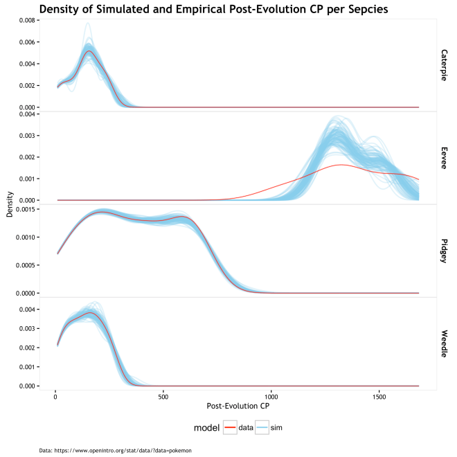

The plot of RMSE for empirical values and the mean simulated value of cp_new shows low error in all be Eevee; same old story. The table below shows the summary statistics, RMSE and Mean Absolute Error (MAE) measured in CP units, and MAE as a percent of the cp_new. So the MAE error is 2.4% to 3.5% on either side of the known cp_new for all but Eevee based on these 100 evolution scenario simulations; Eevee is at 6.7%. I don’t think that is terrible, but I do think it is perhaps a bit overfit. Would a new set of Pokémon evolutions have the same error? Probably not. A more generalizable model can probably be had by relaxing the assumption that there is one single fixed set of beta parameters, and making them into a random variable.
| Species | Mean CP_new | Sim Mean CP_new | SD of Sim CP_new | Mean RMSE | Mean MAE | MAE % of CP_new |
|---|---|---|---|---|---|---|
| Caterpie | 142.10 | 141.26 | 7.31 | 7.47 | 4.95 | 3.50 |
| Eevee | 1375.17 | 1371.44 | 30.07 | 97.74 | 91.69 | 6.70 |
| Pidgey | 366.31 | 365.46 | 11.43 | 12.54 | 8.92 | 2.40 |
| Weedle | 139.10 | 139.13 | 6.91 | 6.97 | 4.50 | 3.20 |

Fixed Parameters are Boring…
The MLE estimation of beta parameters find the one set the maximizes the likelihood of the data. Could there be other sets of parameters that are also likely? Of course! Owing to a bit more of a Bayesian perspective, we can view the beta parameters as a population of potential parameters. Making our first step towards that perspective, we can bootstrap our data and estimate a range or MLE beta shape parameters that make that specific data sample the most likely. This is not truly Bayesian (next section), but it does acknowledge that our data MLE is not a special snowflake and that we can make predictions based on a number of plausible parameters. This then gives us an understanding of the sensitivity of our model relative to the beta parametrized by the MLE.
# Boostrap 1001 different plausible parameters pairs for beta distribution
beta_boot <- bootdist(f3, niter = 1001)
# extract estimates
boot_est <- beta_boot$estim
# get qunatiles of boostrapped parameter estimates and put in table for blog
shp1_boot_est <- round(quantile(boot_est[,1], c(0.025, 0.25, 0.5, 0.75, 0.95)),2)
shp2_boot_est <- round(quantile(boot_est[,2], c(0.025, 0.25, 0.5, 0.75, 0.95)),2)
boot_est_m <- rbind(shp1_boot_est, shp2_boot_est)

Below is a table of the quantiles for the distribution of bootstrapped MLE beta shape parameters. The 50% quantile fulls comfortably close to the previous MLE estimate and the range is not bewilderingly large. However, the amount of acceptable variation in this parameters is completely dependent on the purpose of the model. How well and widely the different parameter values predict is one way to judge how sensitive your model is to this variation.
| Parameter | 2.5% | 25% | 50% | 75% | 95% |
|---|---|---|---|---|---|
| Shape 1 | 0.44 | 0.53 | 0.58 | 0.63 | 0.74 |
| Shape 2 | 10.99 | 14.14 | 16.23 | 18.76 | 23.18 |
Below is a plot for each species with the empirical cp_new as a red dot and a predicted cp_new as a series of blue dots. Each blow dot is one of 100 predictions from a randomly drawn set of beta parameters from the distribution in the scatter plot above.


This table calculates the RMSE of the varying-parameter model predictions using the same metrics as the previous table for the fix-parameter model. The magnitude of the errors are quite similar and still quite comfortable given the exploratory nature of this study (and that it is only Pokémon…).
| species | Mean CP_new | Sim Mean CP_new | Mean SD | Mean RMSE | Mean MAE | MAE % of CP |
|---|---|---|---|---|---|---|
| Caterpie | 142.10 | 141.00 | 7.32 | 7.59 | 4.89 | 3.4% |
| Eevee | 1375.17 | 1371.59 | 30.81 | 99.12 | 93.31 | 6.8% |
| Pidgey | 366.31 | 365.39 | 10.77 | 11.88 | 8.47 | 2.3% |
| Weedle | 139.10 | 139.41 | 7.21 | 7.29 | 4.69 | 3.4% |
Not too telling, but plot of RMSE

So if the errors are pretty darn close, what does this vary-parameter approach give us? The answer is, the safety and security to sleep at night knowing that your entire model and results do not depend solely on a set of parameters, outside of which it all falls apart. it gives us an understanding of the robustness of our assumptions and the variation under which they still hold. It gives us scatter plots of distribution parameters, and nothing is more satisfying! What is doesn’t give us is a fully Bayesian perspective where we estimate the distribution of shape parameters from the data (as opposed to bootstrapped samples) or the ability to impart our own subjective knowledge of potential parameters estimates. But if that sounds like fun… read on.

If you want to be Bayesian… Then Put a Prior on It!
To estimate the beta shape parameters from the data, I will use JAGS (Just Another Gibbs Sampler) to fit the model given the observed data and prior distributions on the parameters (here called alpha for shape1 and beta for shape2). In the Bayesian parlance, these are called the random variables. Not because the are random numbers or anything, but because they are unknown to us and take on a distribution of possibilities. If you don’t know much about Bayesian statistics, there is an internet full of introduction texts and video just a google away. If you want to skip that for now, the main point is that we are using our fixed data set to estimate plausible sets of beta parameters from a universe of infinitely many possible parameters. Previously, we assumed our data was a sample from an infinite set of data and we were estimating the single fixed set of most likely parameters. The end result is something similar to the bootstrapped example where we can draw predictions from many different beta distributions, but here we get that set via Bayes rule and regularizing our parameter estimates with priors.
Here is the model in JAGS code
model_string <- "model{
for(i in 1:length(y)) {       # loop over data points
    y[i] ~ dbeta(alpha, beta) # likelihood
  }
    alpha ~ dt(0,1,1)T(0,)    # Half Cauchy prior
    beta  ~ dt(0,1,1)T(0,)    # Half Cauchy prior
}";
| Parameter | 2.5% | 25% | 50% | 75% | 97.5% |
|---|---|---|---|---|---|
| Shape1 | 0.42 | 0.50 | 0.55 | 0.61 | 0.72 |
| Shape2 | 9.63 | 12.91 | 14.89 | 17.05 | 21.69 |
Here are the quantiles for the beta shape parameter estimates from 20,000 samples from the posterior distribution. Comparing these to the previous ways to estimate these parameters, we have the MLE at shape1 = 0.57, shape2 = 15.68; the mean of the bootstrapped as shape1 = 0.58, shape2 = 16.23, and finally the MAP* of the Bayesian posterior as shape1 = 0.55, shape2 = 14.89. [* the MAP is the Maximum a posteriori estimation, the mode of the posterior distribution]. These estimates are quite similar and given three different estimation methods, seemingly robust. The plot below is 20,000 draws from the posterior along with the MAP point in red and MLE point in yellow.

The Half Cauchy priors here are entered into the JAGS model as a special case of the T distribution with one degree of freedom and then truncated at 0. The prior/posterior plot of the beta shape parameters appear as such.


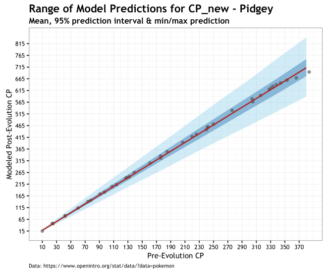
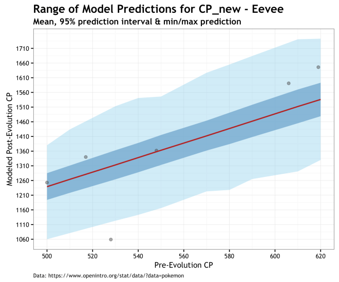
Finally, the plots below give us a prediction for the range of post-evolution CP for unobserved Pokémons for our different species. The range of predictions in these plots illustrates the uncertainty of our data and out priors propagated through the model and into the posterior. Of the three models, this is the one I prefer because of the accounting for uncertainty. Even if it makes higher variance predictions, especially for Eevee, it is more true to the data and our knowledge of the system. The red line is the prediction using the MAP estimate, dark blue cone is the 95% prediction interval of the posterior, and the light blue cone is the minimum and maximum cp_new predicted values. Finally, the gray dots are the observed data.


Conclusions
I think the mechanism for calculating post-evolution CP (at least for Pidgey, Caterpie, Weedle, and Eevee) can be approximated well as a random drawn from a probability distribution, randomly signed, and added to an established species mean percent post-evolution increase. I also think that the portability distribution from which these random variations is drawn is a beta distribution; after all it is a distribution of probabilities. Finally, I think the parameters that define this beta distribution center on approximately 0.57 and 15.6 for the first and second shape parameters (mean of three approximation methods).
If that the actual method by which the app calculated the post-evolution CP, probably not. Is is a good first approximation that makes stable predictions with an acceptable error? I think so. Was it fun to do and contributed to an very long blog post; most certainly.
Final take away: you can use this model to estimate what the post-evolution CP of your Pokémon will be. If you don’t feel like doing that, just pick the one with the highest CP and HP and let random chance take over.
The #rstats code for this analysis is in this GIST

[…] If you were left unsatisfied by this, here is some more complex PokemonGo analysis […]
LikeLike
[…] my previous post on estimating Pokemon CP, I did a very similar task by estimating a beta distribution density with JAGS. The approach here […]
LikeLike