
Edited 04/01: Added Tufte boxplots and Violin plots to bottom of post (Gist code updated)!
How to visualize numerous distributions where quantiles are important and relative ranking matters?
This post is inspired by two things
- I am working with the R packaged called Information to write some Weights of a Evidence (WoE) based models and needed to visualize some results;
- While thinking about this, I listed to the @NSSDeviations podcast and heard Hilary Parker (@hspter) say that she had little use for boxplots anymore, but Rodger Peng (@rdpeng) spoke in support for the boxplots. A new ggplot2 vs. base, did not ensue…
Having heard the brief but serendipitous exchange by Rodger and Hilary, I got to thinking about what other approach I could use instead of my go-to boxplot. Below I will go through a few different ways to visualize the same results and maybe a better approach will be evident. The R code for all that follows [except raw data… sorry] is at this Gist. Let me know what you think!
Data
I go back to WoE pretty frequently as an exploratory technique to evaluate univariate variable contribution by way of discrimination. I have a bit of a complicated relationship with WoE as I love the utility and simplicity, but I don’t see it as the final destination. Archaeology has been dabbling in WoE for a while (e.g. Strahl, 2007) as it is a comfortable middle ground between being blindly adherent to a narrow range of traditional variables and quantifying discrimination ability of these variables in the binary (presence/absence) case. There is also the push-button access to a spatial WoE tool in ArcGIS that has added to its accessibility. But this post isn’t about that; I will finish that rant post another time.![]()
In using the Information package, I was deriving WoE, Information Value (IV), and Adjusted IV (AdjIV) measures for a series of variables. These variables are related to the presence/absence for a sample of 199 know site locations. Each site location and pseudo-background are measures on a ~10-meter grid for a total of 68,322 presence measure and 204,966 pseudo-background samples; a ratio of 1:3 site/background.
The AdjIV measure is a version of IV that is adjusted based on a cross-validated (CV) “penalty” score (see Information package docs for some more details). The cross-validation is done via a single train/test split in the data, in my case it was 80% to 20% train to test. If you have not played with archaeological site location data much, you won’t realize just how noisy that data can be; really high variance stuff. So in my experience, using a single jackknife split like this is not adequate to understand the variance and uncertainty in the metrics (AdjIV in this case) . Basically, any single split of site data can give pretty variable results no matter what you are measuring. It is just the nature of the data.
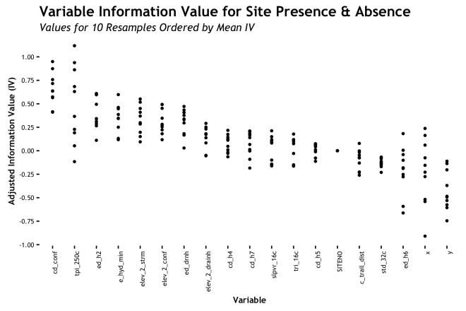
To better understand the variance in AdjIV, I ran the routine on many different resamples of the data. [I should note that the resamples are set up to not split the same site location across train and test sets even though there are multiple measurements per site.] This results in 
Presentation
I looped through 10 iterations of the Information::create_infotable() function using random resamples of train and test sets per loop. Ten resamples is an arbitrary number and is fine since this is mostly about plotting, but I would probably use a repeated k-folds CV if I were doing this for a final model. The result of this loop is a dataframe with the AdjIV values for each of the 18 variables (including X and Y coords) for each of the 10 resamples. My goal is to understand how the AdjIV measures vary for each variable acorss all resamples. The implication being that if no matter how the data are sliced or diced, the AdjIV stays pretty constant, that is a good sign. However, if the AdjIV swings from useful to useless depending on random splits on the site sample, that is pretty bad news.
Table
The first and easiest way to see these results is a simple table of the AdjIV summaries per variable. Below is how this comes out with the AdjIV summarized as a minimum, 5th percentile, mean, median, 95th percentile, and maximum. This gives us a really explicit understanding of how the 10 resampled values are distributed… But, it is a table and it is kind of a pain to look at. Sorting this will help give us an better estimate of which variables are more useful, but in the end, it is a little ungainly. A graphic would be more useful.
| Variable | Minimum | p5 | Mean | Median | p95 | Maximum | |
|---|---|---|---|---|---|---|---|
| 1 | c_trail_dist | -0.26 | -0.25 | -0.10 | -0.07 | 0.04 | 0.08 |
| 2 | cd_conf | 0.41 | 0.41 | 0.65 | 0.64 | 0.92 | 0.95 |
| 3 | cd_h4 | -0.06 | -0.05 | 0.07 | 0.08 | 0.20 | 0.22 |
| 4 | cd_h5 | -0.11 | -0.10 | 0.01 | 0.03 | 0.07 | 0.08 |
| 5 | cd_h7 | -0.18 | -0.14 | 0.07 | 0.10 | 0.21 | 0.21 |
| 6 | e_hyd_min | 0.12 | 0.12 | 0.35 | 0.37 | 0.54 | 0.60 |
| 7 | ed_drnh | 0.03 | 0.09 | 0.30 | 0.33 | 0.45 | 0.47 |
| 8 | ed_h2 | 0.11 | 0.18 | 0.40 | 0.34 | 0.61 | 0.61 |
| 9 | ed_h6 | -0.66 | -0.63 | -0.21 | -0.19 | 0.10 | 0.18 |
| 10 | elev_2_conf | 0.12 | 0.15 | 0.31 | 0.28 | 0.49 | 0.49 |
| 11 | elev_2_drainh | -0.05 | -0.05 | 0.14 | 0.18 | 0.27 | 0.29 |
| 12 | elev_2_strm | 0.09 | 0.12 | 0.33 | 0.33 | 0.54 | 0.55 |
| 13 | SITENO | 0.00 | 0.00 | 0.00 | 0.00 | 0.00 | 0.00 |
| 14 | slpvr_16c | -0.16 | -0.16 | 0.02 | 0.09 | 0.18 | 0.21 |
| 15 | std_32c | -0.23 | -0.20 | -0.13 | -0.13 | -0.07 | -0.07 |
| 16 | tpi_250c | -0.12 | -0.04 | 0.50 | 0.50 | 1.04 | 1.12 |
| 17 | tri_16c | -0.16 | -0.16 | 0.02 | 0.09 | 0.15 | 0.18 |
| 18 | x | -0.91 | -0.74 | -0.22 | -0.19 | 0.20 | 0.24 |
| 19 | y | -0.75 | -0.68 | -0.43 | -0.49 | -0.12 | -0.11 |
Lines
Another natural thought is the use of a line to show how each variable changes over each of the resamples. The intuition being that a very wiggly line shows high variance and a line that is lower on the AdjIV axis is less important. This encodes a few aspect of the data into one chart, but is challenged by the number of variables and need to use color or labels to distinguish each line/variable

Clearly, this provides challenges. The ability to use meaningful discrete colors for more than a handful of features is tough. Plus, the need for a legend to identify each line is a real pain. Here I used (abused?) the line end labels using the ggrepel package as described by Bhaskar K. over at his blog. The lines are identifiable, but it is not good as is. Plus, we can see that some lines are generally higher on the Y axis than others, but a sense of variance is not well achieved. Perhaps, smoothing the lines would help?
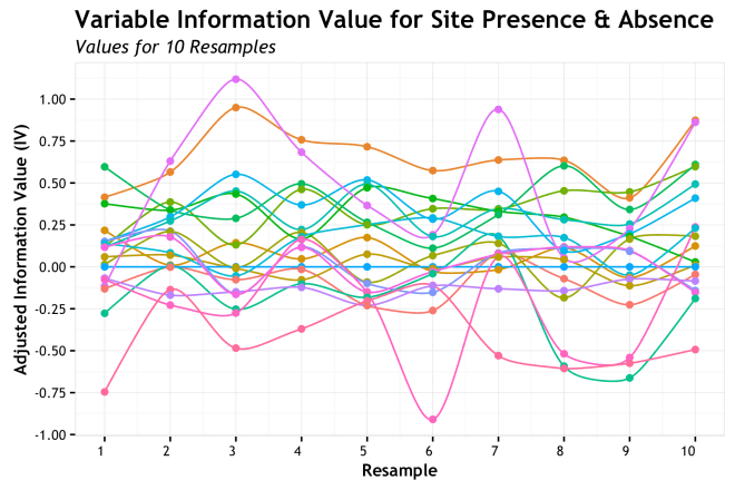
Not so much. This is using the amazing ggalt package by @hrbrmstr to spline my lines. Still, the problems of the basic line chart remain. Lines changing over resamples is logical, but doesn’t convey info well in this case. Let’s try something else.
Bars
A really common way to show variability of a measure for different groups is a bar plot with error bars. I see this in journals often and I think it has a deep historic president, but I have never been much of a fan. However, lets take a look. This graphic has the bar height as the mean AdjIV value with the high/low error bars showing the standard error. The error bars could show other quantities such as the 95% confidence interval, but I went with the often used standard error.
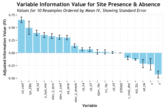
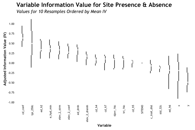
Aggregating the AdjIV measures by variable and showing a range is a much better approach that the lines showing measure over resample. The error bar gives a sense of the variability, but it also hides a lot. The most significant improvement here is the ordering or the variables from highest AdjIV to lowest. This gives an instant sense of which variables are potentially most predictive (in a univariate sense) and their relative ranking. This provides a more concise visual representation of the information with less clutter than the lines.
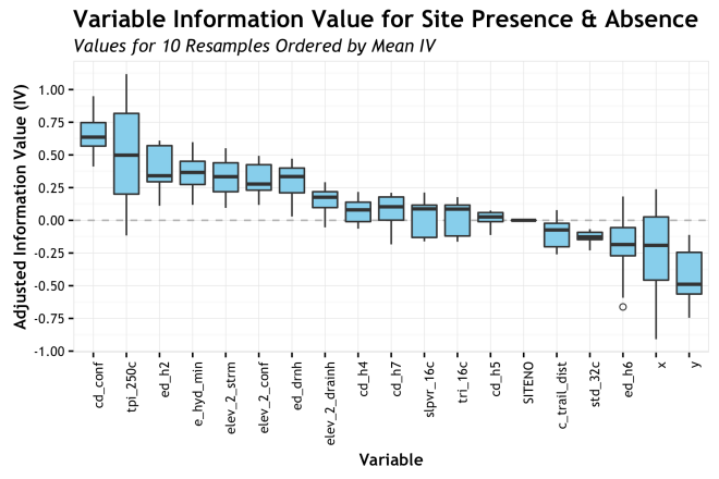
Boxplot
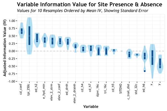
Box-and-whiskers plots take the idea of showing aggregate variability a few steps further. For each variable, again ordered by AdjIV, the boxplot shows the median, the Interquartile Range (IQR) as the box, ± 1.5 IQR as the whiskers, and outliers as circles. The specific quartiles or stations used for the box/whisker elements can be adjusted based on specific needs, but these are pretty standard. The point of this is to show more moments of the distribution for each variable. Whereas the bars only showed the mean and some semblance of error, the boxplot shows the full range of the distribution and a sense of skewness based on where the bar is within the box. Also, the display of outliers can be truly helpful sometimes. Take for example, the variable cd_h7 (cost-distance to wetlands) where the median is roughly 0.2 AdjIV, but the whiskers show us that there is a negligible inclusion of zero or less within out 10 resamples. That is good to know! Again, sorting by mean AdjIV is really helpful is quickly assessing relative importance. The boxplots work pretty well in my estimation.
Distribution
If the point of the boxplot is to characterize a distribution, why not do so directly? In the NSSD podcast episode I mentioned earlier, this approach is what Hilary mentioned as a more likely method for her to use. I agree that seeing the full distribution of density function of the metric will give you all there is to know, but sometimes it is less convenient than more abstracted methods as those above; IMHO.
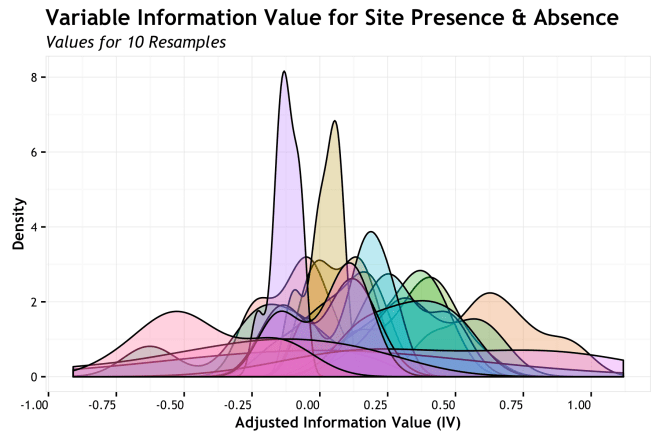
Oh the horror! Obviously, the direct overlay of distributions does not work well for this many variables. Labeling, color, overlap all go out the window. We do get an overall sense that a number of variables have a high density the fill in between 0.25 and -0.25 AdjIV while a smaller number take more assertive stances closer to 0.5 and – 0.5, but it is impossible to figure out which is which. We need to separate the variables.
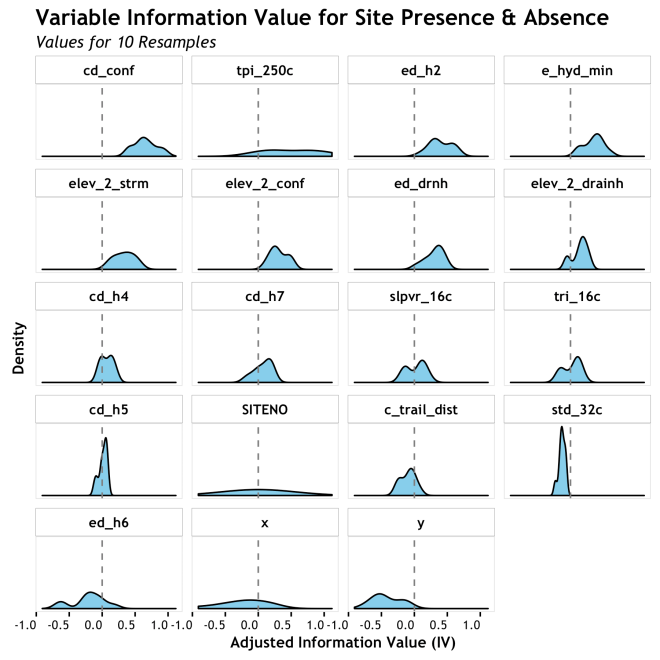
This is getting better. Each density is clearly identifiable and can be assess relative to zero, but it is hard to assess relative to each other. It is ordered, as are the box and bar plots, with the highest mean AdjIV first, but in the grid format (sometimes call “small multiples”) it is hard to see it. Not a bad presentation, but not very cohesive.
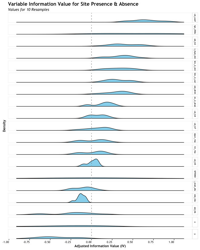
The final example takes the same presentation as the gridded densities, but stacks them for a better direct comparison. This makes the relative central tendency and spread much more apparent. The challenge here is label size in the facet panels and overall size of the graphic depending on how many variables you have. The boxplot is more responsive to scaling, but this is pretty good for small numbers of densities.
Bi-variate Bonus!!
As a final thought, I figured I would provide a bonus plot just because I had made it and why not? All of the plots above are uni-variate; only concerned about one variable at a time. Often in an exploratory analysis, the next moves are to get into bi-variate assessments to look for interactions in your data or metrics. In this case, I wanted to see how the IV and Penalty metrics from the WoE analysis correlated. As mentioned in the Data section, the AdjIV is simply 
The devil in these details would be a strong positive correlation between IV and Penalty. If present, what this would say to us is that we only get good IV when we also have high error between training and test sets. To me, this is a signal of over-fitting resulting from a small number of sites lending to really high IV, but at the expense of high error because the other sites do not agree. Ideally, a variable will show a consistently high IV across all resamples and have randomly distributed errors. Lets se…

This graphic is sorted with the highest mean AdjIV at the top left and decreases down and to the right. As a broad observation, the highest mean AdjIV variables (cd_cond, tpi_250c, ed_h2,…) have pretty low correlation between IV and Penalty, whereas the lower AdjIV variables have high correlation. This is what you would expect (hope for) if your data where not being heavily influenced by a small number of observations.
As a final toast to this analysis… the above analysis raises the question of how does the relative ranking of variables change when the CV penalty is considered and IV becomes AdjIV?
![]()
Well, there it is. The variables that started out high on IV also ended up pretty high on AdjIV with some shuffling . Those that were lower, typically stayed lower or climbed in some instances. A very important thing to note is how the X and Y (coordinate) variables dropped to the bottom of AdjIV after the penalty was introduced. This makes complete sense when you figure that creating a WoE based on an X coordinate will fit really well to training data, but fail miserably on test data. The fact that they dropped to the bottom is a great reality check that the AdjIV metric is giving us intuitive results.
Conclusion
Well, I am not really sure there is a conclusion to boxplot vs. non-boxplot since all visualization subjective and dependent on the data at hand. However, for these data, I do prefer the boxplot or the stacked densities over all others. When I started this data analysis I went straight for the boxplot and I probably will again in a similar situation. The densities were not much more to code and give a good perspective, but I think boxplots do it in a bit more of a visually concise manner. But, to each their own and I hope you find a way that works for you! If you have any tips or different presentations, please let me know!
More Plots: Violin and Tufte Added 04/01:
A fun discussion of this topic took place on twitter yesterday discussing boxplots, violin plots, and Tufte. I figured I would add more plots inline to capture some of that.
In a tweet thread, Rob Simmon (@rsimmon) suggested the use of a mirrored density plot arranged like a boxplot; what he was describing is known as a violin plot. This type of plot is used pretty heavily in some areas, but I have never found a use case for it myself. This is when Alison Hill (@apreshill) posts a bunch of nice examples of violin plots and give a good justification. She suggested that if you have a large number of samples or you are worried about multi-modal distributions, the violin plot can visualize this whereas the boxplot could hide some of this nuance. While the density plots below would show multi-modality, the violin is arranged like a box plot and can be overlain with the median, IQR another measures to bring the benefits of a box plot. I think it is a really good justification.
There are bunch of different ways to integrate the violin area with boxplots or just to use if on its own. Alison had some really nice examples and it is definitely something I will look into in the future.
Tufte
I am going to restate Godwin’s Law for this purpose: “As an online discussion of Data Visualization grows longer, the probability of a comparison involving Edward Tufte approaches 1.”
And the point came when Ari Friedman (@AriBFriedman) retwetted that he liked this post, but it was missing the Tufte boxplot. Thanks to the magic of the ggthemes package by Jeffrey B. Arnold, this was an easy problem to remedy.

Median and whiskers

Median, IQR, and min/max
median, IQR, and whiskers offsett
And a dot plot just for fun….
Finally, I had a new plot of my own to throw it he mix. A bit of an April Fools joke and a bit of a self induced challenge (on which I had spent entirely way too much time!) I present that Steam and Leaf Box plot! (simulated data)

Notes
- All of the R code to makes this plots is available in this Gist
- wordpress.com doesn’t do LaTeX tables, so you get bulky HTML instead
- In the NSSD podcast, Hilary did say that she is usually mostly interested in the mean. In which case worrying about characterizing the distribution as I did here might just not be useful; therefore neither are boxplots. Rodger defended boxplots as well the distribution. Again, whichever works for your case is the best approach
- These are not my finest graphics, but I just wanted to show the different styles without spending too much time.
- I use the term “importance” to discuss the AdjIV metric ranking of the variables, but I am being a bit lazy. I know there are plenty ways to rank variable “importance” and none of the are the right or “best” way. IV is just another metric…
- WoE as Bayesian, Bayes Factor, Naive Bayes; Discuss…

Wonderful – thanks for sharing
LikeLike