Building a ggplot2 Step by Step
I have included this viz on my blog before; as an afterthought to a more complex viz of the same data. However, I was splitting out the steps to the plot for another purpose and though it would be worth while to post this as a step-by-step how to. The post below will step through the making of this plot using R and ggplot2 (the dev version from Github). Each code chunk and accompanying image adds a little bit to the plot on its way to the final plot; depicted here. Hopefully this can help or inspire someone to take their plot beyond the basics.
Step 1 is to load the proper libraries which include ggplot2 (of course), ggalt for the handy ggsave function, and extrafont for the use of a range of fonts in your plot. I did this on a mac book pro and using the extra fonts was pretty easy. I have done the same on a windows machine and it was more of a pain. Google around and it should work out.
library("ggplot2") # dev version
library("ggalt") # dev version, for ggsave()
library("extrafont")
Create the data… I included R code at the end of the post to recreate the data.frame that is in the plots below. You will have to run that code block to make an object called dat so that the rest of this code will work.
# run the code block for making the 'dat' data.frame.
# code is located at bottom of this post
So that whole point to why I was making this plot was to show a trend in population change over time and over geography. The hypothesis put forth by the author of this study (Zubrow, 1974) is that over time population decreased in the east and migrated to the west. The other blog post I did covers all of this in more details.
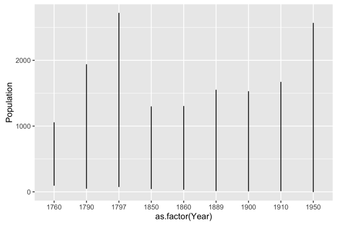
If one were starting out in R, they may go straight to the base plot function to plot population over time as shown below. [to be fair, there are many expert R users that will go straight to the base plot function and make fantastic plots. I am just not one of them. That is a battle I will leave to the pros.]
# base R line plot of population over year
plot(dat$Population ~ dat$Year, type = "l")

That result is underwhelming and not very informative. A jumble of tightly spaced lines don’t tell us much. Further, this is plotting data across all of the 19 sites we have data on. Instead of pursuing this further in base plot and move to ggplot2.
ggplot2 is built on the Grammar of Graphics model, check out a quick intro here. The basic idea is to plot by layers using data and geometries intuitively. To me, plotting in ggplot2 is much like building a GIS map. Data, layers, and geometries; it all sounds pretty cartographic to me.
Pretty much every ggplot opens with a call to ggplot() which specifies the data.frame and the aesthetic, called by the aes() function. The use of the term aesthetic was not very intuitive to me at first, because there are lots of places in the plot to affect the appearance of objects. However, I cam around to it with the understanding that it addresses the aesthetics of the data itself and not the representations of the data that are created in the geom_ functions. Basically, just go with it.
Here the aesthetic is set to use our data dat and the aesthetics of the Year variable as the x axis and Population as the y axis. Year is turned into a discrete variable with the use of as.factor() otherwise, ggplot would interpret it as a continuous variable and space the x-axis according to the integer years, which are not evenly spaced.
If you run the code just on the first line, you’ll get nothing. This line only defines the data. The second line geom_line() defines the representation of the data. There are a number of geometries to work with, but geom_line is sometimes a good thing to start with if you are not sure what your looking for. So far we are just using the default styling.
# ggplot line plot of population over year
ggplot(dat, aes(x = as.factor(Year), y = Population)) +
  geom_line()
But this doesn’t work very well either, but it is more informative than the base plot. Essentially, this is drawing a line with a length equivalent to the maximum over all sites’ populations for each year. It does show a increase from 1850 to 1950, but our hypothesis is about migration, not necessarily about overall population change through time. If this was an important to show, a bar graph may be a better choice.
# ggplot bar plot of population over year
ggplot(dat, aes(x = as.factor(Year), y = Population)) +
  geom_bar(stat = "identity")
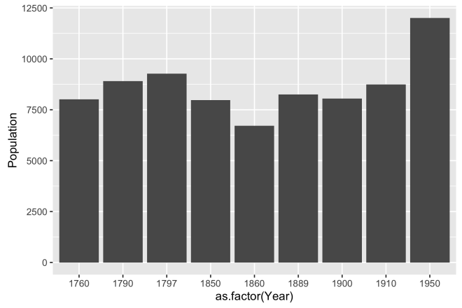
Changing to geom_bar changes the way the data are represented. Now, the data is an aggregated sum of all populations for each year. Although this is not how we plan to display the data, it is important to realize the all we did was change he geom, but the reference and aesthetic of the data stay the same; ggplot does that work for you.
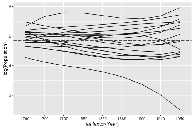
The reason the geom_line representation above didn’t work out is because the first line did not consider that the data have populations over time for 19 distinct site locations. We need to condition the plot to show the data for each site using the same axis and scales. This is achieved by adding a group parameter to the aes() call. In this case, we are grouping by the Site variable in the data. Everything else is the same as the first ggplot.
# ggplot line plot of population over year, grouped by Site
ggplot(dat, aes(x = as.factor(Year), y = Population, group = Site)) +
  geom_line()
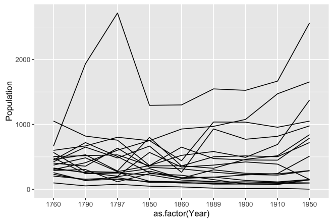
This is getting somewhere. The plot is reminiscent of the base plot, but properly grouped and more legible. Somewhere around here could be a place to end this plot as it does show each site as a distinct line, it shows the populations, and it shows it over time. If the lines were labelled as their position in our east to west geography, it could be interpreted; albeit begrudgingly. We need to get more separation in the lines, a better way to tell them apart, and a better sense of geography.
# same with smoothed lines
ggplot(dat, aes(x = as.factor(Year), y = log(Population), group = East)) +
  geom_smooth(method = "lm", formula = y ~ splines::bs(x, 3),
            se = FALSE, color = "gray10", size = 0.5)

Two big things happened here, first we transformed the population to the log scale, by using log() in the aes() call. This is done because there are a small number of large values in Population and I want to interpret population change as a multiplicative effect. Secondly, I used the geom_smooth geom to de-noise the data a bit. The parameters of this geom include method = "lm" to specify a linear model, formula = y ~ splines::bs(x,3) to specify that it is a third degree basis spline. The higher the degree the more flexible the line will be. A first degree spline would essentially be a straight line linear fit. The trends in the data are a little more apparent.
# smoothed lines as a horizontal line at the mean
ggplot(dat, aes(x = as.factor(Year), y = log(Population), group = East)) +
  geom_smooth(method = "lm", formula = y ~ splines::bs(x, 3),
              se = FALSE, color = "gray10", size = 0.5) +
  geom_hline(yintercept = mean(log(pop)), linetype = 5, color = "gray35")
Here, a horizontal line is added at the point on the y-axis that represents the mean(log(pop)) where pop is a variable of the population figures for all sites and all time periods. This gives us a reference point for visualizing relative change, but it still is a bit of a jumble.
# facet wrap on the East_Label, each site is its own plot
ggplot(dat, aes(x = as.factor(Year), y = log(Population), group = East)) +
geom_smooth(method = "lm", formula = y ~ splines::bs(x, 3),
se = FALSE, color = "gray10", size = 0.5) +
geom_hline(yintercept = mean(log(pop)), linetype = 5, color = "gray35") +
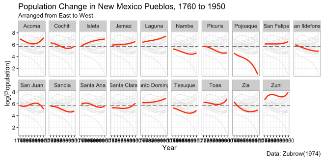
facet_wrap( ~ East_label, nrow = 2)
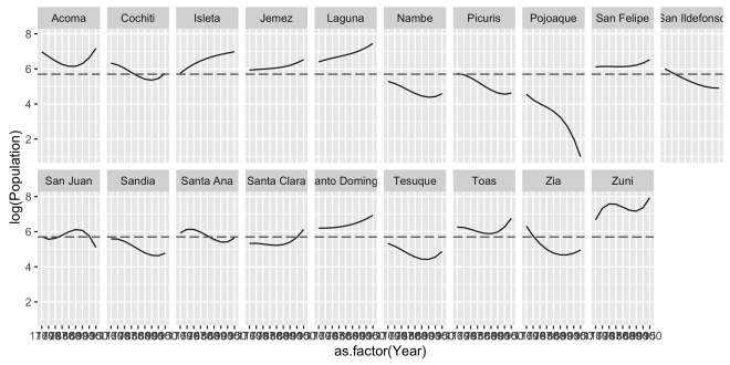
Then the magic happens! Take the previous plot and add facet_wrap( ~ East_label, nrow = 2) and ggplot knows to divide (or facet) each group defined by East_label into its own plot panel. The notation of the facet_wrap function follows the formula interface by using the tilde ~ operator. In facet_wrap the tilde always comes first followed y the variable or variables on which the facets are split. then nrow = 2 governs how the facets are laid out; split into two rows. This is different fro how facet_grid handles faceting. In facet_grid the formula is used to make rows from the variable on the left of the ~ and columns from variables on the right. A period . can be used in facet_grid to indicate that no faceting should be done on that side of the tilde. Faceted plots can appear quite similar, but it is important to know if you need to simply wrap rows or columns with facet_wrap or arrange rows and columns of an n by n grid with facet_grid.
The East_label is a factor variable in dat that reassigns he sie name ordering each site from East to West. Another change is to set the aes( group = East) in the first line. Since East and East_label are just re-encoding of Site we can use either in that first line, but I did this just to keep it straight in my head. This plot is now really getting somewhere as you can read the change in log population for each site and they are ordered from East to West. Sometimes the Tufte oriented folks call this layout “Small Multiples“, but that term never fell into my vernacular. But that’s just me.

While we can see each site now, it is hard to get a sense of the relative change now that the lines are separated into facets. Also, there is some formatting of labels that needs work.
# added background data into each facet
# adapted first geom_smooth to call the data and set the facet variable to NULL
# this way it plots all the data everytime, ignoring the facet call
# color the data in the second geom_smooth a brigth red to focus on that site's line
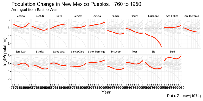
ggplot(dat, aes(x = as.factor(Year), y = log(Population), group = East)) +
geom_smooth(data = transform(dat, East_label = NULL),
method = "lm", formula = y ~ splines::bs(x, 3),
se = FALSE, color = "gray90", size = 0.5) +
geom_hline(yintercept = mean(log(pop)), linetype = 5, color = "gray35") +
facet_wrap( ~ East_label, nrow = 2) +
geom_smooth(method = "lm", formula = y ~ splines::bs(x, 3),
se = FALSE, color = "red", fill = "gray70")
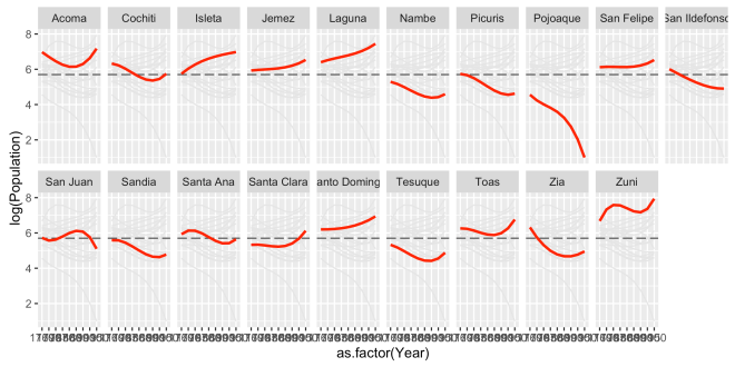
To the previous plot, we added a faded gray representation of all of the sites lines to each facet and then accentuated that facets’ site by making it red. This is accomplished by adding another geom_smooth() with the same parameters (except color) at the bottom of the plot code and doing trick in the upper geom_smooth(). In the top geom, we don’t want the data to be faceted into individual lines, so another version of dat is called with data = . In this new call to the the data, we use the dplyr::transform() function to see East_label to NULL. Since East_label is the variable that is being faceted and it is NULL in these data, they are ignored by the facet_wrap() call and repeated in full in each facet.
Note two important things: 1) the aes() is carried over to the new data because I did not make a new call to aes() ; and 2) the order of the geoms in the code block control the layering effect. Since the geom_smooth() that makes the red lines is later in the code block, it layers on top of the previous geom calls. All in all, this is pretty much the manner in which I wanted to display the data, but there is a bit of formatting left to make it look nicer.
# Start to work on design by adding theme_bw() to remove most of the defaults
ggplot(dat, aes(x = as.factor(Year), y = log(Population), group = East)) +
  geom_smooth(data = transform(dat, East_label = NULL),
              method = "lm", formula = y ~ splines::bs(x, 3),
              se = FALSE, color = "gray90", size = 0.5) +
  geom_hline(yintercept = mean(log(pop)), linetype = 5, color = "gray35") +
  facet_wrap( ~ East_label, nrow = 2) +
  geom_smooth(method = "lm", formula = y ~ splines::bs(x, 3),
              se = FALSE, color = "red", fill = "gray70") +
  theme_bw()
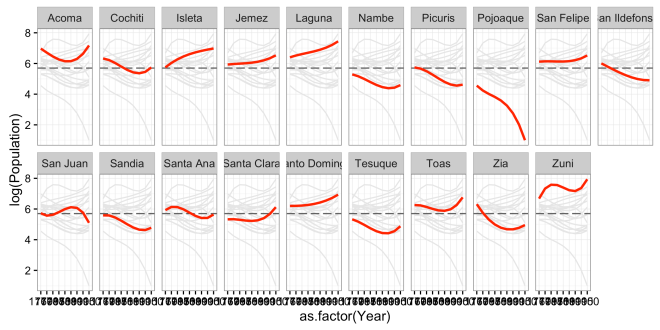
Here I simply added the line theme_bw() and changed from the default colors to a predefined theme. ggplot2 has a number of different themes, but I like this because it strips away style instead of adding it. theme_void() and theme_minimal() are also good for this.
# Modify the axis lables, title, subtitle, and caption
# this require the developers version of ggplot2 and ggalt (both from Github)
ggplot(dat, aes(x = as.factor(Year), y = log(Population), group = East)) +
geom_smooth(data = transform(dat, East_label = NULL),
method = "lm", formula = y ~ splines::bs(x, 3),
se = FALSE, color = "gray90", size = 0.5) +
geom_hline(yintercept = mean(log(pop)), linetype = 5, color = "gray35") +
facet_wrap( ~ East_label, nrow = 2) +
geom_smooth(method = "lm", formula = y ~ splines::bs(x, 3),
se = FALSE, color = "red", fill = "gray70") +
theme_bw() +
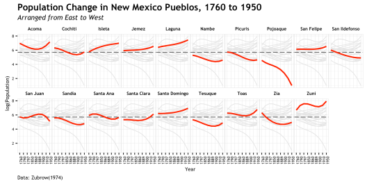
labs(title="Population Change in New Mexico Pueblos, 1760 to 1950",
subtitle="Arranged from East to West",
caption="Data: Zubrow(1974)",
x = "Year")
Then we work on the title, subtitle, axis, and cation. This feature requires the dev version of ggplot2. the call to create this is straightforward.
# added theme() block where all the detail work is done
# these lines adjust the facets
ggplot(dat, aes(x = as.factor(Year), y = log(Population), group = East)) +
  geom_smooth(data = transform(dat, East_label = NULL),
              method = "lm", formula = y ~ splines::bs(x, 3),
              se = FALSE, color = "gray90", size = 0.5) +
  geom_hline(yintercept = mean(log(pop)), linetype = 5, color = "gray35") +
  facet_wrap( ~ East_label, nrow = 2) +
  geom_smooth(method = "lm", formula = y ~ splines::bs(x, 3),
              se = FALSE, color = "red", fill = "gray70") +
  theme_bw() +
  labs(title="Population Change in New Mexico Pueblos, 1760 to 1950",
       subtitle="Arranged from East to West",
       caption="Data: Zubrow(1974)",
       x = "Year") +
  theme(
    strip.background = element_rect(colour = "white", fill = "white"),
    strip.text.x = element_text(colour = "black", size = 7, face = "bold",
                                family = "Trebuchet MS"),
    panel.margin = unit(0, "lines"),
    panel.border = element_rect(colour = "gray90")
  )
This version adds a call to theme(). This is where numerous hours can be sunk into a plot. The theme() function allows for the extensive adjustment to many different aspects of the plot. The help page on theme() gives a sense of how much there is to work with here. These first few changes work on how the facets appear and are spaced. Also, the first use of element_text is used here to control the font characteristics. This is where the extrafont package comes in.
# Formatting axis text
# X axis text is rotate 90 degrees
# the changing of fonts requires the extrafont package and a bit of doing
# easier on OSX than Windows, but follow tutorial here:
# http://blog.revolutionanalytics.com/2012/09/how-to-use-your-favorite-fonts-in-r-charts.html
ggplot(dat, aes(x = as.factor(Year), y = log(Population), group = East)) +
  geom_smooth(data = transform(dat, East_label = NULL),
              method = "lm", formula = y ~ splines::bs(x, 3),
              se = FALSE, color = "gray90", size = 0.5) +
  geom_hline(yintercept = mean(log(pop)), linetype = 5, color = "gray35") +
  facet_wrap( ~ East_label, nrow = 2) +
  geom_smooth(method = "lm", formula = y ~ splines::bs(x, 3),
              se = FALSE, color = "red", fill = "gray70") +
  theme_bw() +
  labs(title="Population Change in New Mexico Pueblos, 1760 to 1950",
       subtitle="Arranged from East to West",
       caption="Data: Zubrow(1974)",
       x = "Year") +
  theme(
    strip.background = element_rect(colour = "white", fill = "white"),
    strip.text.x = element_text(colour = "black", size = 7, face = "bold",
                                family = "Trebuchet MS"),
    panel.margin = unit(0, "lines"),
    panel.border = element_rect(colour = "gray90"),
    axis.text.x = element_text(angle = 90, size = 6, family = "Trebuchet MS"),
    axis.text.y = element_text(size = 6, family = "Trebuchet MS"),
    axis.title = element_text(size = 8, family = "Trebuchet MS")
  )
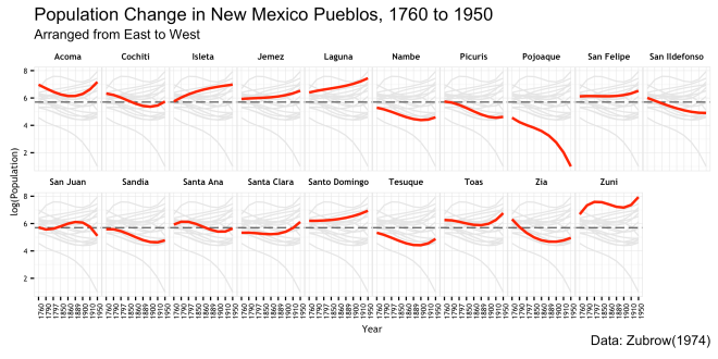
The next additions to theme() adjust the font of the axis text. The call to axis.text.x also uses the angle parameter to rotate the dates along the x-axis facets to be more legible.
# Finally adjust the title and caption text
# again, this requires the dev version of ggplot2 and galt
ggplot(dat, aes(x = as.factor(Year), y = log(Population), group = East)) +
  geom_smooth(data = transform(dat, East_label = NULL),
              method = "lm", formula = y ~ splines::bs(x, 3),
              se = FALSE, color = "gray90", size = 0.5) +
  geom_hline(yintercept = mean(log(pop)), linetype = 5, color = "gray35") +
  facet_wrap( ~ East_label, nrow = 2) +
  geom_smooth(method = "lm", formula = y ~ splines::bs(x, 3),
              se = FALSE, color = "red", fill = "gray70") +
  theme_bw() +
  labs(title="Population Change in New Mexico Pueblos, 1760 to 1950",
       subtitle="Arranged from East to West",
       caption="Data: Zubrow(1974)",
       x = "Year") +
  theme(
    strip.background = element_rect(colour = "white", fill = "white"),
    strip.text.x = element_text(colour = "black", size = 7, face = "bold",
                                family = "Trebuchet MS"),
    panel.margin = unit(0, "lines"),
    panel.border = element_rect(colour = "gray90"),
    axis.text.x = element_text(angle = 90, size = 6, family = "Trebuchet MS"),
    axis.text.y = element_text(size = 6, family = "Trebuchet MS"),
    axis.title = element_text(size = 8, family = "Trebuchet MS"),
    plot.caption = element_text(size = 8, hjust=0, margin=margin(t=5),
                                family = "Trebuchet MS"),
    plot.title=element_text(family="TrebuchetMS-Bold"),
    plot.subtitle=element_text(family="TrebuchetMS-Italic")
  )

Finally, the font characteristics of the title, subtitle,and caption are worked over to match the rest. hjust = 0 is used to move the caption text at the bottom of the plot to the left hand side.
That is basically it!!! There is a fair bit of work in that plot, but really the amount of code from the base plot to the final ggplot is pretty small; much of it is in the theme() details. If I had to do that in illustrator or the like, it would take me much longer that this code did. As stated earlier, I settled on a different version of this plot for my final, but I think this does tell a story when put in the context of the original study. But more importantly, I thought it was a good example to show off the way a ggplot is built
All that’s left to do is save the plot and have a beer!
# save the plot
ggsave(filename = "population.png", width = 8, height = 4)
# Done!
Notes:
This link goes to the BEST ggplot2 tutorial I have come across. It is the post I would like to have written if I were that good at these things. Kudos to the author of that one.
Here is the environment that generated these plots:
> sessionInfo()
R version 3.2.2 (2015-08-14)
Platform: x86_64-apple-darwin13.4.0 (64-bit)
Running under: OS X 10.10.5 (Yosemite)
locale:
[1] en_US.UTF-8/en_US.UTF-8/en_US.UTF-8/C/en_US.UTF-8/en_US.UTF-8
attached base packages:
[1] stats graphics grDevices utils datasets methods base
other attached packages:
[1] ggalt_0.3.0.9000 extrafont_0.17 ggplot2_2.1.0
loaded via a namespace (and not attached):
[1] Rcpp_0.12.5 Rttf2pt1_1.3.4 magrittr_1.5
[4] maps_3.1.0 splines_3.2.2 MASS_7.3-43
[7] munsell_0.4.3 colorspace_1.2-6 R6_2.1.2
[10] plyr_1.8.4 dplyr_0.5.0 tools_3.2.2
[13] grid_3.2.2 gtable_0.2.0 ash_1.0-15
[16] KernSmooth_2.23-15 DBI_0.4-1 extrafontdb_1.0
[19] proj4_1.0-8 assertthat_0.1 tibble_1.0
[22] RColorBrewer_1.1-2 rsconnect_0.4.1.4 labeling_0.3
[25] scales_0.4.0
Here is the code to create the dat data.frame object that we are plotting
year <- c(1760, 1790, 1797, 1850, 1860, 1889, 1900, 1910, 1950)
sites <- c("Isleta", "Acoma", "Laguna", "Zuni", "Sandia", "San Felipe",
           "Santa Ana", "Zia", "Santo Domingo", "Jemez", "Cochiti",
           "Tesuque", "Nambe", "San Ildefonso", "Pojoaque", "Santa Clara",
           "San Juan", "Picuris", "Toas")
south <- c(seq_along(sites))
east <- c(14, 18, 17, 19, 12, 11, 13, 15, 10, 16, 9, 4, 3, 7, 5, 8, 6, 2, 1)
pop <- c(
  c(304, 410, 603, 751, 440, 1037, 1035, 956, 1051),
  c(1052, 820, 757, 367, 523, 582, 492, 691, 1376),
  c(600, 668, 802, 749, 929, 970, 1077, 1472, 1655),
  c(664, 1935, 2716, 1294, 1300, 1547, 1525, 1667, 2564),
  c(291, 304, 116, 241, 217, 150, 81, 73, 150),
  c(458, 532, 282, 800, 360, 501, 515, 502, 721),
  c(404, 356, 634, 339, 316, 264, 228, 219, 285),
  c(568, 275, 262, 124, 115, 113, 115, 109, 145),
  c(424, 650, 483, 666, 262, 930, 771, 817, 978),
  c(373, 485, 272, 365, 650, 474, 452, 449, 789),
  c(450, 720, 505, 254, 172, 300, 247, 237, 289),
  c(232, 138, 155, 119, 97, 94, 80, 80, 145),
  c(204, 155, 178, 107, 107, 80, 81, 88, 96),
  c(484, 240, 251, 319, 166, 189, 137, 114, 152),
  c(99, 53, 79, 48, 37, 18, 12, 16, 2),
  c(257, 134, 193, 279, 179, 187, 222, 243, 511),
  c(316, 260, 202, 568, 343, 373, 422, 388, 152),
  c(328, 254, 251, 222, 143, 120, 95, 104, 99),
  c(505, 518, 531, 361, 363, 324, 462, 517, 842)
)
dat <- data.frame(Year = rep(year, length(sites)),
                  Site = rep(sites, each = length(year)),
                  Population = pop,
                  South = rep(south, each = length(year)),
                  East = rep(east, each = length(year)))
dat$East_label <- rep(factor(sites, levels = (sites[order(east)])), each = length(year))

Nice plot! I’m liking this ‘show the background data’ movement.
I’ve been on the lookout for a nice example to use as a motivator for my new package `ggghost`, and this fits the bill nicely. Here’s a gist that explains how it might be useful here:
This file contains bidirectional Unicode text that may be interpreted or compiled differently than what appears below. To review, open the file in an editor that reveals hidden Unicode characters.
Learn more about bidirectional Unicode characters
QuantArch.R
hosted with ❤ by GitHub
Rather than writing out the data import/tidying steps and the final code block for people to copy, `ggghost` allows one to save the entire thing (data + code) for reproducibly loading back in to a session.
Full details of the package are here: https://github.com/jonocarroll/ggghost .
LikeLike